Key Brochure Design Elements
A brochure’s ultimate goal is to lead its reader to action. Actions might include making a purchase, finding out more information, donating or adding themselves to a mailing list. However, to achieve this end goal, the intended reader must first pick up the brochure and read it.
How do you achieve this? How do you design a brochure that screams ‘read me’ at its intended audience?
Here are eight key brochure design elements that will increase the likelihood of someone picking up and reading your brochure.
-
Covers Command Attention
The cover is the first thing your potential reader sees. If you get this right, you increase the chances of them picking up your brochure and looking inside.
So, what does an eye-catching cover include?
Eye-catching covers are uncluttered. They hint at what is included inside rather than telling the reader everything and leaving them confused and overwhelmed. Great covers typically consist of just three elements: the company’s logo, a captivating phrase that makes the reader need to know more and a standout image that captures the imagination.
How you combine these three elements will depend on your sector, your offering and your intended readership; however, the most effective brochures tend to have their effective phrases placed at the top of their brochures in large type. The phrase usually consists of no more than ten words.
-
Compelling Text that Attracts Attention
An attractive, well-designed cover causes people to pause and look, but it is the phrase that makes them pick it up and piques their curiosity.
It is not only the length of the phrase that is important but also the actual content. It should go without saying that your grammar and spelling must be on point. It also needs to raise the reader’s curiosity.
You can achieve this in several ways, including asking a question or starting a phrase on the cover and continuing it inside the brochure. Be careful not to overuse technical terms and avoid jargon and anything that could be interpreted as ‘clickbait’.
-
Creative Use of Colour Sets the Tone
Colour is an excellent way of hinting at the type of business and the services it provides. Colour sets the mood and lets the reader know what to expect, so it is crucial to get your colours right.
Bright colours are perfect for businesses that offer whimsical or fun services or are focused on children’s play equipment or toys. However, you need to be careful not to overwhelm and create a brochure that is so colourful it hurts to pick it up.
Muted colours and natural hues are more suited to businesses that want to convey a serious message. Here the balance needs to be between coming across as serious and avoiding looking washed out and fading into the background.
-
Using the Right Font and Font Size.
Your message is also affected by your font choice. For example, Comic Sans may not be the best choice if you run a surgical or medical centre. You want a font that reflects the seriousness of your offering and your professionalism.
You want a font that is easy to read so that your message is not lost. Curly, elegant fonts may look fabulous, but if they are hard to read, your audience will quickly discard your brochure.
Size also matters when it comes to fonts as it helps create visual interest. Using different size fonts highlights the importance of specific pieces of information. Headlines should be larger than subheadings, with body text being smaller, but not to the point that it is difficult to read.
-
Strategic use of White Space
You must not be afraid of white space in your brochure.
Creating space is just as crucial as using text and images. Used correctly, white space stops your brochure from becoming cluttered, which means your message is more precise and the reader’s attention is drawn to the important information within the brochure.
If you overdo white space, then your brochure will look incomplete, so balance is essential.
-
Organise with Boxes.
Boxes can be used in much the same way as white space to draw attention to key information and/or images. Boxes should be used sparingly; otherwise, their purpose is defeated.
-
Choose an Appropriate Fold
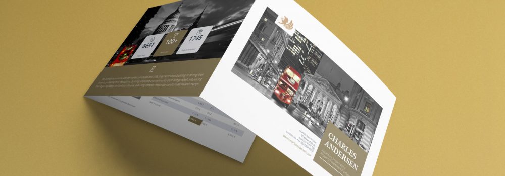
How your brochure folds is just as important as how it looks and the information it contains. There are two main brochure folds: Z-fold and trifold.
Where there is a lot of information to present, a Z-fold is commonly used. This presentation means that only one panel is displayed at a time, stopping the reader from being bombarded with too much information at once.
Where there is less information and a sizeable central image is used, a basic trifold layout is more appropriate.
-
Photographs Bring your Brochure to Life
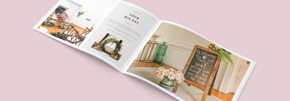
Images are an excellent way to communicate your company’s message alongside your text. Images need to be of good quality and not be overused stock photos. It is important not to rely too heavily on them and only use about 2-4 pictures in the brochure.
Ensuring that these eight elements are included in your basic brochure layout will help your brochure create a favourable impression of your business. Of course, you need to add your creative spark to the brochure to ensure that your well-designed brochure helps increase your company’s bottom line.
If you liked this post you may want to read our blog post on How to Write a Brochure.
Get in touch with us if you want to know more about designing a brochure. We create a stunning design that is just for you. Creative Harmony is built on expertise and our team can take your ideas to develop a stunning brochure design layout. Our team can bring your bespoke brochure design layout to life.
You can see relevant examples of our work Manufacturing Brochure Design and Healthcare Company Brochure Design.
Brochure Design Agency London
How do you create the perfect brochure? By working with brochure designers like Creative Harmony. A well-designed brochure speaks volumes about your company, its confidence, and the respect you have for your customers. It might be a prospectus, a piece of commemorative literature, or an annual report. The subject doesn’t matter. What counts is the thought put into creating something attractive, useful and enjoyable for your readers. A professionally designed brochure or report, with high-quality images and copy, is the print equivalent of a firm handshake. Click here to find out more.
Want a brochure designed by professionals?
Need an award-winning brochure design agency to take care of everything from brochure concepting to printing? No time for those design-it-yourself brochure apps?
We’ll give you a brochure that looks good AND works hard to deliver what you need it to, whether that’s:
- More Sales
- Greater Awareness
- Communicating Your Values
Talk to our expert team of brochure designers today.

