Top 5 graphic design trends new designers may want to avoid
Graphic designers are in demand. Be it freelancing or a 9-5 hour job, graphic designers have a massive demand in the market. People and companies want attractive images and designs for their websites to lure customers. Pictures speak 1000 words, and graphic designers know how to create relevant and thought-provoking images within a few hours.
New designers often follow the latest trends to make a mark in graphic design. While some trends are genuinely good and stay for a long time, others are not up to the mark. The purpose of graphic design is to convey the right message to the audience and appeal to their creative sense as well. One should not follow the graphic designing trends blindly. All graphic design trends are not that good. New designers need to use their wisdom and avoid trends that can be disastrous.
In this post, we will discuss a few graphic design trends new designers should avoid.
-
Bold typography
Typography is an integral part of graphic design. It helps to boost readability, optimize texts and images.
Bold typography is in vogue nowadays. It can help to turn a simple line into a strong statement. It can help a brand to convey its message and create a strong impression on the audience. Bold typography is especially useful for slogans or taglines. It can help to make texts look perceptible. However, bold typography has a few severe drawbacks, which new users must be aware of. Some of them are given below.
It is tough to comprehend bold typography. So, it may not help to retain the attention span of the audience for a long time. Bold typography converts texts into imagery. People may not be willing to invest too much time in reading, analyzing, and understanding the visuals simultaneously.
There is yet another problem with bold typography. It may look commercial or over promotional. Social media campaigns and advertisements often use bold typography to catch the attention of the audiences. But the audience is not a fool. Customers are well aware of the marketing strategies of the companies. So, they may find bold typography overtly and run away.
-
Asymmetrical layouts
New designers often feel that asymmetrical layouts to break the order and make graphics stand out from the rest. They think that asymmetry helps to create a sense of awe among the audience. But this is not always true.
Asymmetrical images may ruin the main objective of the design. The main text or critical information may get lost. Users won’t spend hours to find a particular text in a website. They would search the text in the same place where it was before. Plus, it may become challenging for clients to get used to the asymmetrical design and then dig out the information. They may switch to another website after spending a few seconds. Time is precious for all users. They want everything at the right time and in the right place. And, if they can’t find what they are looking for in your design, they will go somewhere else within a few seconds.
-
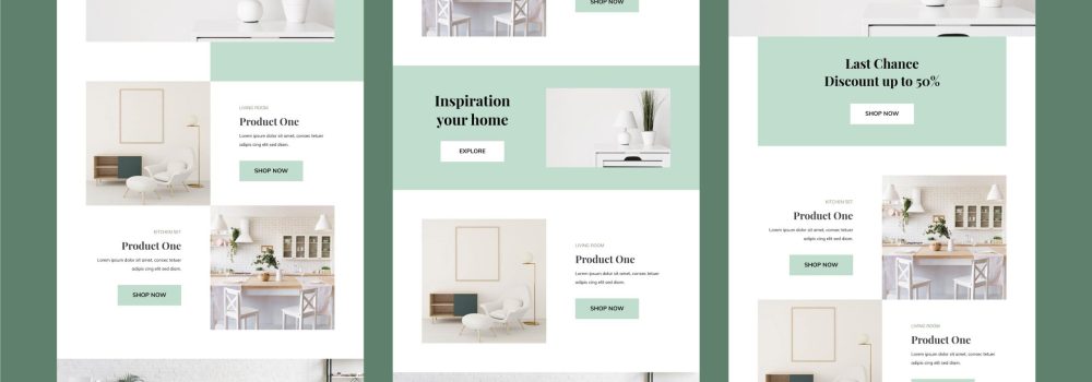
Bold color theme and graphic design trends
Color is an essential element in graphic design. It helps to catch attention and highlight various aspects. Muted and natural color themes ruled the graphic design industry in the last decade. Now, the trend has shifted to bright and bold colors. Bright colors catch the attention of the audience quickly. Plus, they help to make a website stand out from the rest. It also helps to highlight the essential sections of a blog or a website.
The logic is not bad, but bright colors are not suitable for the eyes. Our eyes can’t look at software created and enhanced bright colors for a long time. They take a toll on our eyes. Moreover, bright colors hinder the prolonged, unified natural experience. So, readers may not stay on the website for a long time. As such, the bounce rate of the website will be relatively high. Neon colors hinder text readability and lead to poor user experience.
-
Stock photography
New designers often look for shortcuts to transform the dull and monotonous look of a website. They use stock photographs to enhance the visual look of a website. But this trend is outdated and redundant. If they want to create a powerful visual experience, then they should create free-flowing designs on their own. They can use various tools of software and their creativity to create powerful images. People are ready to pay for unique, interesting, thought-provoking, and original photos. Many people can edit and use stock photography by using various tools. Companies don’t need new designers for that.
-
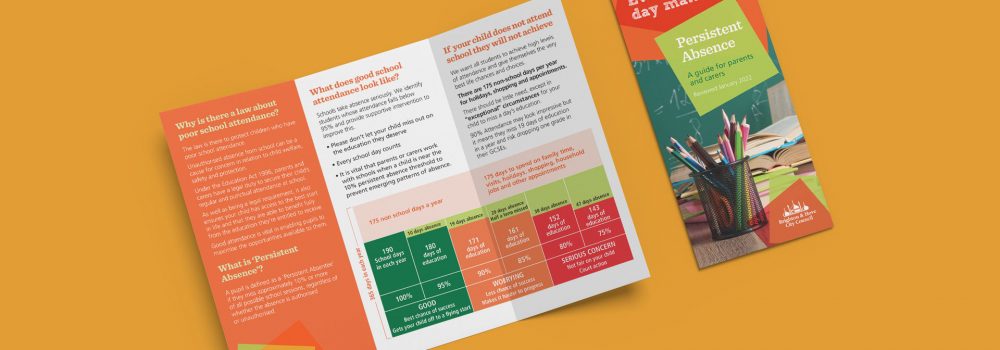
Filling up the entire white space
Earlier graphic designers tried to use the entire white space that was allotted for graphic design. That was the trend. Graphic designers used to pat their shoulders when they designed something without any white space. But that was past. The scenario has changed in the present time.
In the present time, people want sophisticated and clean designs. If new designers follow the old trend and create a design without any white space, then it may look space-constrained, unorganized, cluttered, and cumbersome.
New designers should rely on their artistic sense and basic instincts at the time of creating designs. They can create a design without any white space. But, in that case, they should make the design in a way that doesn’t look clustered. The design should look clean and professional. Otherwise, their images and designs may look amateurish.
It is best to create designs with white space. Less is acceptable nowadays. Sometimes, one small image is enough to make uproar amongst the viewers. New designers have to think and create eye-pleasing visuals with the right intent. Images should allow the eyes to pause and give sufficient space to breathe.
New designers must go through various websites and look at their designs. They must read blogs on graphic design trends and techniques. Other than it copyright law and fair use issues, font licensing, piracy, plagiarism, and image usage rights are some of the other legal issues that graphic designers need to be knowledgeable about.It’s high time they know what is in and what is out.
Contact Creative Harmony today to take advantage of our in-depth insight. Together we can benefit your organisation. Exceptional graphic design for your business is just one call away.