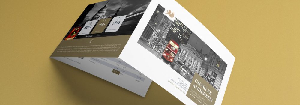
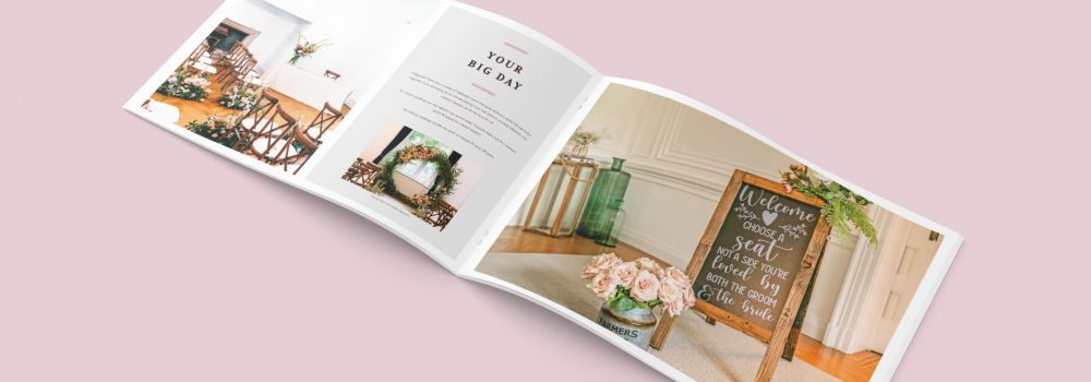
Do’s and Don’ts of Brochure Design?
Whether a business wants to promote a product or service, it shouldn’t underestimate the benefits of printed media. The right brochure can help a company highlight the benefits of a product or service or showcase products in the best way possible.
However, despite the benefits brochures can bring businesses, some considerations must be made before finalising the design. Companies wanting to make the most of brochure design can do so by considering the do’s and don’ts of brochure design beforehand.
Do’s of Brochure Design
Every business will have its own unique requirements regarding brochure design, but the following is an overview of some of the most critical factors to consider.
Create an Appealing Design
Many businesses can overlook the importance of design in favour of information, but the brochure needs to capture the attention of its audience. As such, the brochure design must be appealing without compromising the brand.
Consider the Printing
When designing a brochure, businesses mustn’t overlook the file size. A small oversight could mean the finished design looks pixelated, leading to an unprofessional look that will deter readers. Before investing time in the design, it is essential to confirm the dimensions, otherwise the process could take longer than it should.
Use Illustrations
It might surprise some people, but the brain can process visuals 60,000 times faster than text. Of course, there is a lot of information that cannot be conveyed by images alone, but they should be included when considering brochure design.
In addition to being appealing, they help break up the text, ensuring the brochure design always has its reader’s attention.
Add a QR Code to the Final Brochure
Understandably, many businesses assume there is no way of connecting printed media to the online world, but this isn’t the case. QR is an abbreviation for ‘Quick Response’ and takes the form of several black and white squares used to store information, including website addresses and social media links.
To access the information contained within the QR Code, readers simply need to use their smartphone camera and be redirected to the online link immediately. Furthermore, the dimension requirements for a QR Code are minimal, meaning that they can be included on all brochures without using valuable space.
Be Aware of the Customer Journey
One of the biggest mistakes many businesses can make regarding brochure design is trying to create a design that guarantees sales in every instance. Although the right brochure design can win a company a lot of new business, potential customers must be aware of the benefits of a product or service.
Rather than hard sell on a brochure, a company must ensure that there is plenty of information available for a customer to make an informed decision, which often results in more sales over time.
Don’ts of Brochure Design
In addition to the processes that must be followed when carrying out brochure design, some methods must be avoided when aiming for perfection. If a business finds its brochure design hasn’t had the expected impact in the past, it may be worthwhile considering the following ‘don’ts’.
Use Too Much Information
Plenty of information is a must for brochure design. Otherwise, an audience can be unaware of the message being promoted. However, it is crucial a business doesn’t overwhelm people by including too much information.
The amount of information contained can depend on the type of brochure being created, but in most instances, there should be a headline, contact information, brand elements, a call to action along with visuals.
If you’re unsure how to manage the different elements of brochure design, reaching out to a professional may be worthwhile to ensure companies can create the perfect layout.
Use Too Many Fonts
To stand out among the competition, many companies may try to win readers’ attention using several different fonts, but overdoing it could mean the text looks uninviting. Different fonts are acceptable but should be limited to one or two rather than several. Companies must also ensure that the fonts used are legible.
Copy the Competition
When a competitor’s printed media is popular, it can be tempting for others to copy the formula. Although understandable, using a design similar to the competition could cause confusion at best or make the company seem like an imposter at worst.
Staying true to the brand and being fully aware of the business objectives ensures that the company can create an appealing brochure design that doesn’t emulate the competition.
Finding the perfect outlay regarding brochures can be difficult at times, and businesses with several departments to focus on will want a solution that is fast and affordable. Fortunately, there are options available that are cost-effective for a business and have the desired effect regarding customer interest.
Businesses who are currently unable to meet their deadlines regarding printed media can outsource their brochure design to a professional that can provide feedback and assistance throughout the process.
Conclusion
We can create a stunning design that is just for you. Creative Harmony is built on expertise and our team can take your ideas to develop a stunning brochure design layout. Our team can bring your bespoke brochure design layout to life.
You can see relevant examples of our work Recruitment Agency Brochure Design and Healthcare Company Brochure Design.
Brochure Design Agency London
How do you create the perfect brochure? By working with brochure designers like Creative Harmony. A well-designed brochure speaks volumes about your company, its confidence, and the respect you have for your customers. It might be a prospectus, a piece of commemorative literature, or an annual report. The subject doesn’t matter. What counts is the thought put into creating something attractive, useful and enjoyable for your readers. A professionally designed brochure or report, with high-quality images and copy, is the print equivalent of a firm handshake. Click here to find out more.


