10 Top Creative Brochure Design Tips
Ensure your brochure design delights with these top tips
Does your brochure design draw the attention that it should? Do you want to know how to make sure it does? We’ve put together tips from some of the top experts in brochure design that will take your design from intermediate to impressive.
-
Know your rationale before you begin
Always begin by asking the client why they want a brochure and what their objectives are. It may be that they want a new brochure because their last one didn’t work. They may be looking for their first brochure because all their competitors have one.
If the client comes with a prepared brief, compare this to the information they have given you. Does the brief meet the objectives? Where do you need to take the brief to make it meet the client’s needs?
-
Limit the fonts you use
It is possible to have too much of a good thing, and the same is true of fonts. You do not need to source never used before fonts or change it for every heading or paragraph. This is just time-consuming and will look messy, overwhelming and unprofessional. The best brochures have heading, subheading and body text fonts. Clients often take the lead with fonts as they have fonts in place that are part of their corporate identity.
-
Prepare your paper stock
Paper stock is an often overlooked element of brochure design. Your client may have set ideas about the size and type of paper they want to use for the brochure. It is worth checking and discussing alternatives such as uncoated paper, for example.
-
Perfect your copy
One of the most undervalued elements in brochure design is excellent copy. Many individuals and companies don’t realise that copy is integral to the overall design concept. Experiment with copy at the early stages of a brochure design project to see if it needs reworking. Don’t think of your headlines as something you drop in at a later stage.
-
Readers come first
The brochure’s end purpose should be at the front of your mind at every stage of the design process. Is the brochure being posted out as a response to a website request? Is it a leave behind brochure or an exhibition giveaway? Think about what the brochure will say when it is opened. Remember to design for the person opening the brochure and not for you.
-
Simple statements work best
Sometimes the simple ideas are the best when you want something to stand out and be noticed. Avoid overwhelming the reader with text or images, especially cliched images that are overused. If the client presents you with these ideas and images, show them examples of how simple is better. Make literal statements that leave no room for misinterpretation and are clear about the benefits of the company and its products or services.
-
Communicate and share
Rather than hiding away with the brief for several weeks and then coming back with three finished concepts for the client to tear apart, communicate clearly from the very beginning. Sketch out ideas on layout pads, share ideas and keep the client informed on the progress at every stage.
-
If it’s not broken….
It can be tempting to redesign every element of an existing brochure just because you can. Similarly, it can be tempting to use strange or off the wall ideas because you think it will get your brochure noticed. Sometimes this is necessary; however, most of the time, it isn’t, and it comes across as awkward and forced. Stick with what you know works and tweak the parts that don’t. If you have fonts that work, use them. There is a reason why Rockwell is well-known for headlines, and Helvetica is many designers go-to font.
-
First impressions need to be good impressions
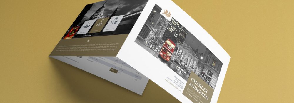
Your brochure design needs to be the perfect fit for the client’s business and reflect its offering and sector. A new business might need a brochure that looks enticing on an exhibition stand; an existing company with a track record for reliability and continuity will need a brochure that reflects its history. Similarly, while a high-end fashion retailer may want a brochure that looks luxurious and expensive, this is hardly the image that a charity is going to want.
-
Perfect your imagery
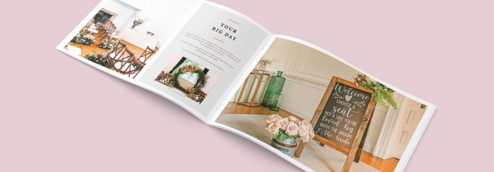
Most people flick through brochures before they decide whether to read them or not. This means it is the images that will catch their eye first and be integral in their decision to go back and read further. Brochures need to be pleasurable to flick through, and that means good quality, appropriate photos. Custom, high-quality photographs are always ideal. However, when budgets are tight, you may need to rely on stock images. There are some very good stock images available, but you need to take your time and find the best images that don’t scream stock. Never cut corners when it comes to images.
Get in touch with us if you want to know more about designing a brochure. Bespoke design is what you need to sell your business products and services. We create a stunning design that is just for you. Creative Harmony is built on expertise and our team can take your ideas to develop a stunning brochure design layout. Our team can bring your bespoke brochure design layout to life.
You can see relevant examples of our work Property Development Brochure Design and Recruitment Agency Brochure Design.
If you are considering a new brochure then it is not hard to guess a primary concern. While you might be concerned about quality, the brochure design cost is probably on your mind. You can read more about this here: How to Keep Your Brochure Design Cost Under Control and Get an Effective Product in 4 Effortless Steps.
Professional Brochure Design
An impactful, professional and creative brochure gives the right first impression to your clients, builds reputation and further enhances your company profile, services and reputation. Creative Harmony is a specialist in the design & publishing of promotional, coffee table and corporate brochures, annual reports, prospectuses, catalogues. Click here to find out more.
Want a brochure designed by professionals?
Need an award-winning brochure design agency to take care of everything from brochure concepting to printing? No time for those design-it-yourself brochure apps?
We’ll give you a brochure that looks good AND works hard to deliver what you need it to, whether that’s:
- More Sales
- Greater Awareness
- Communicating Your Values
Talk to our expert team of brochure designers today.

