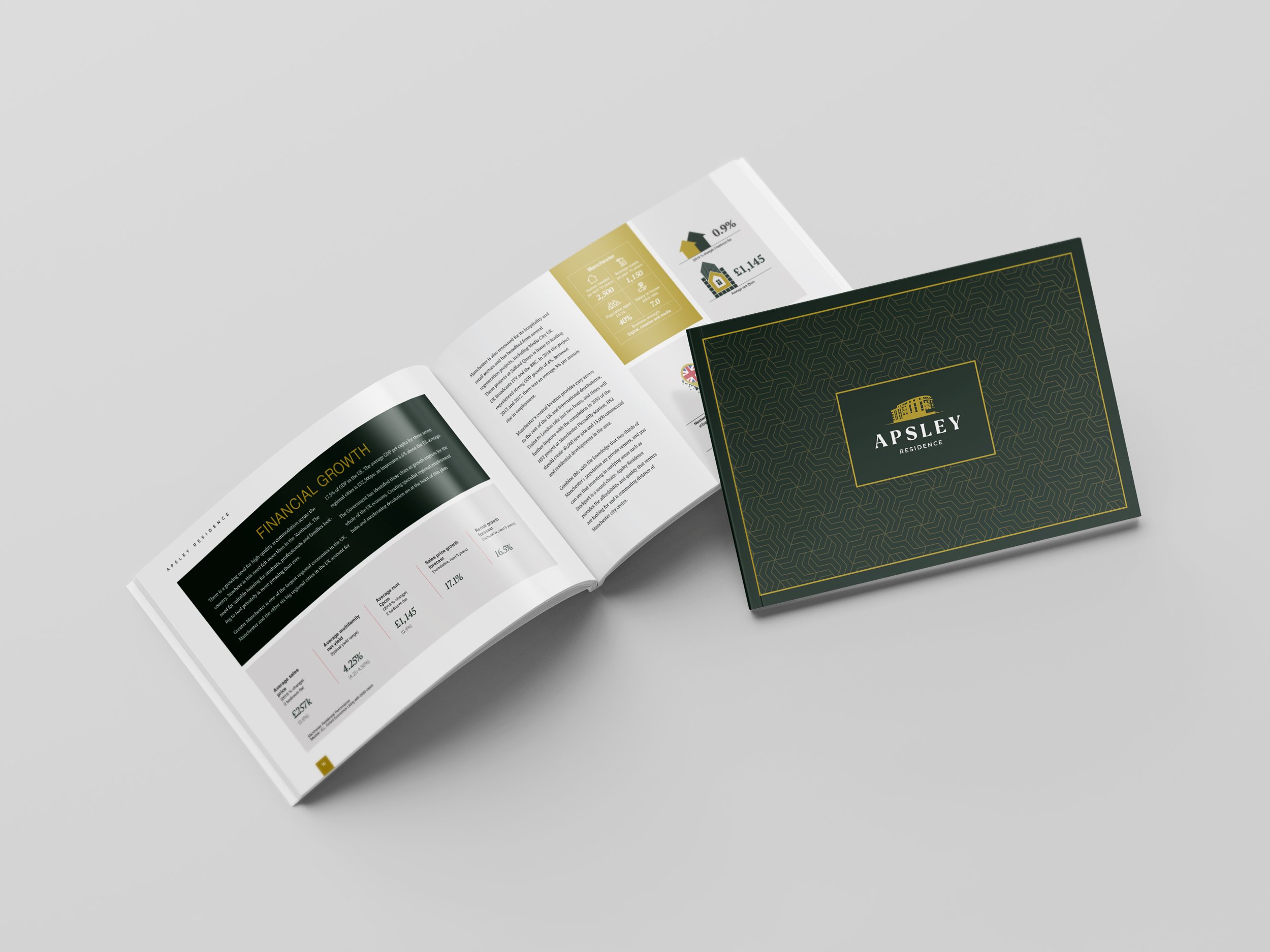
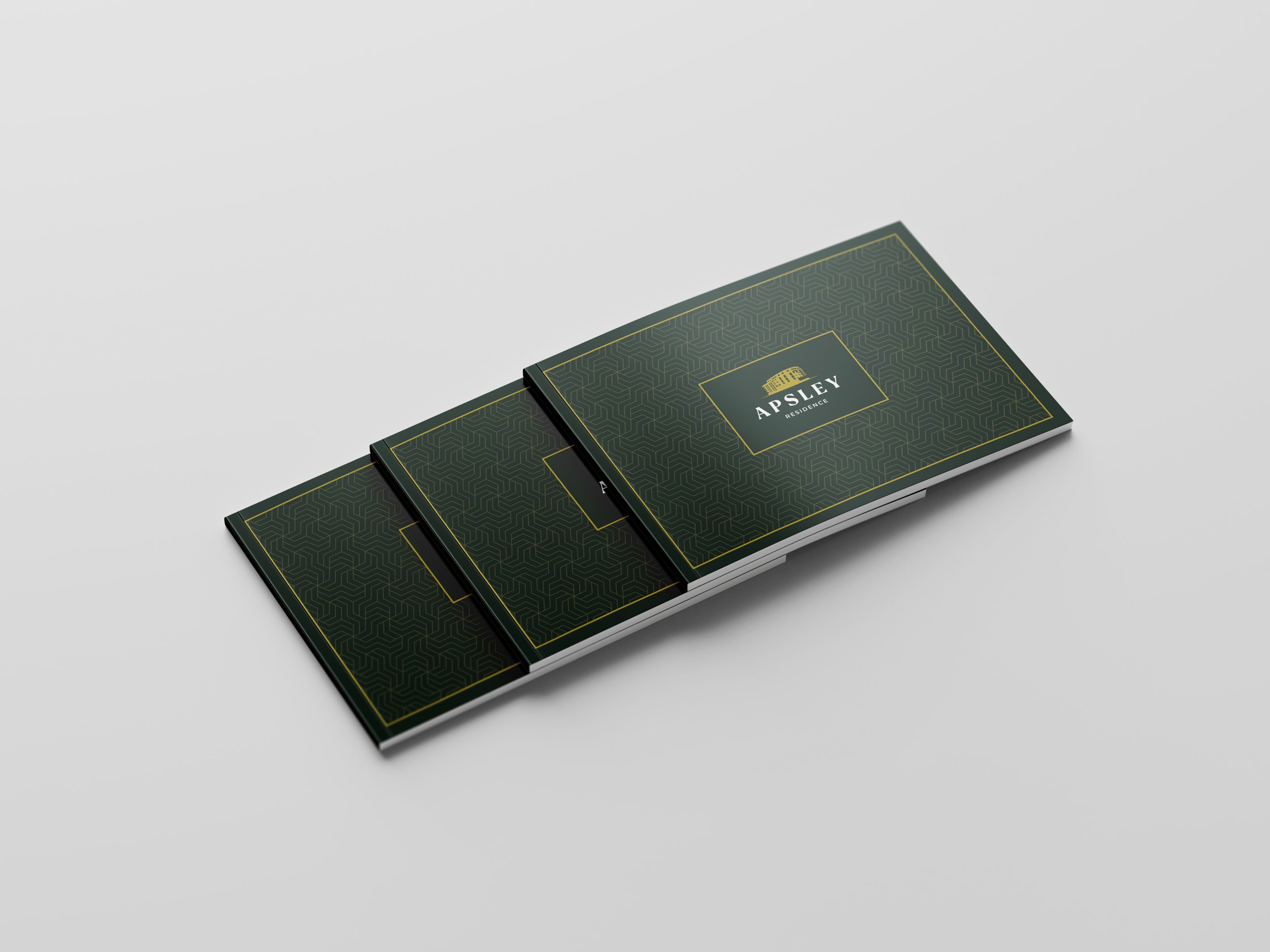
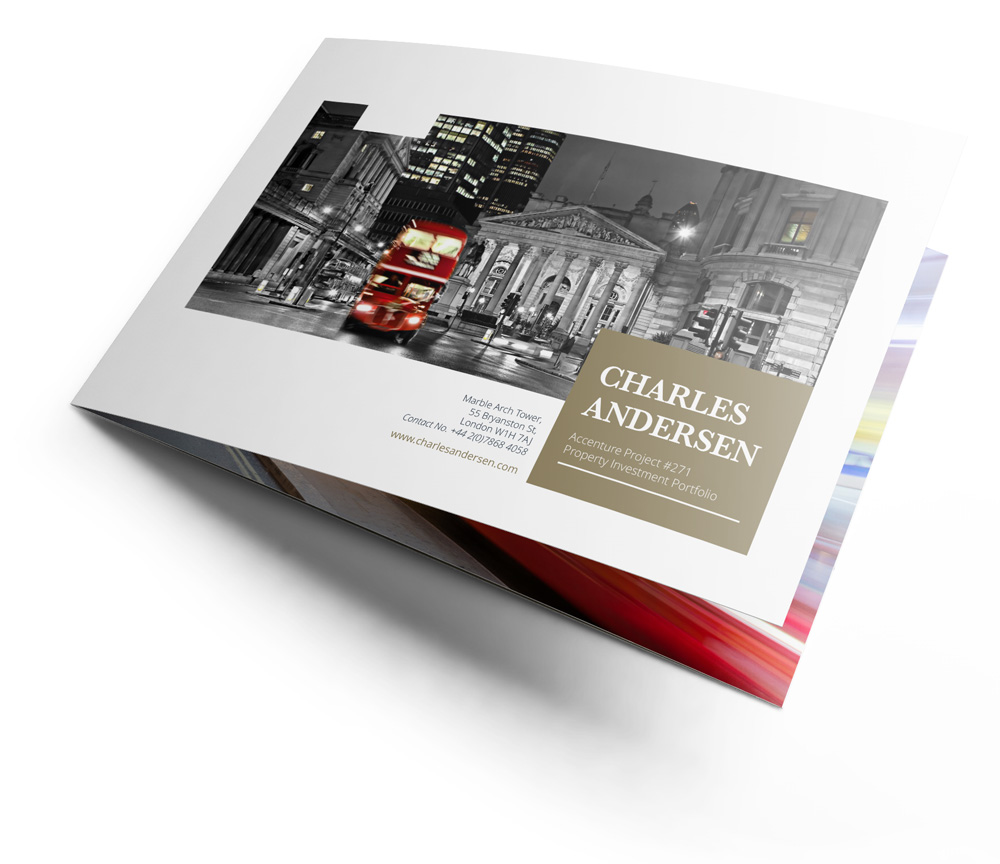
The brochure was explicitly designed with print media in mind. The branding colours were combined with geometric patterns on the cover to draw the eye towards the residence’s name and the critical information contained within the brochure.
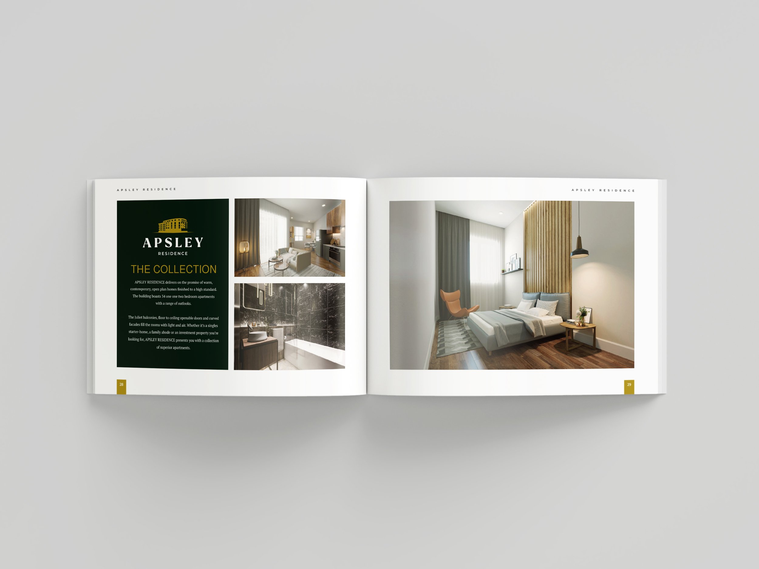
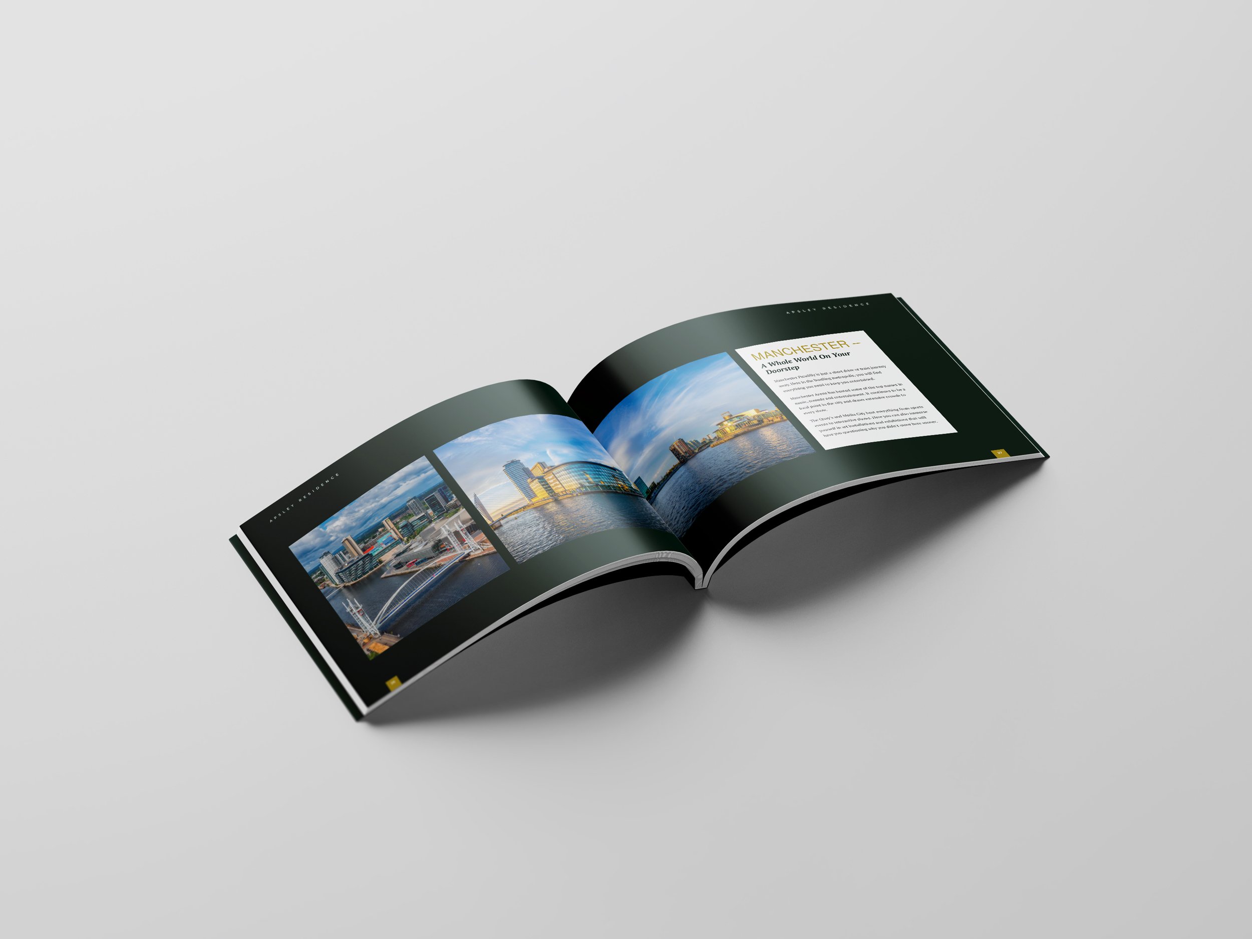
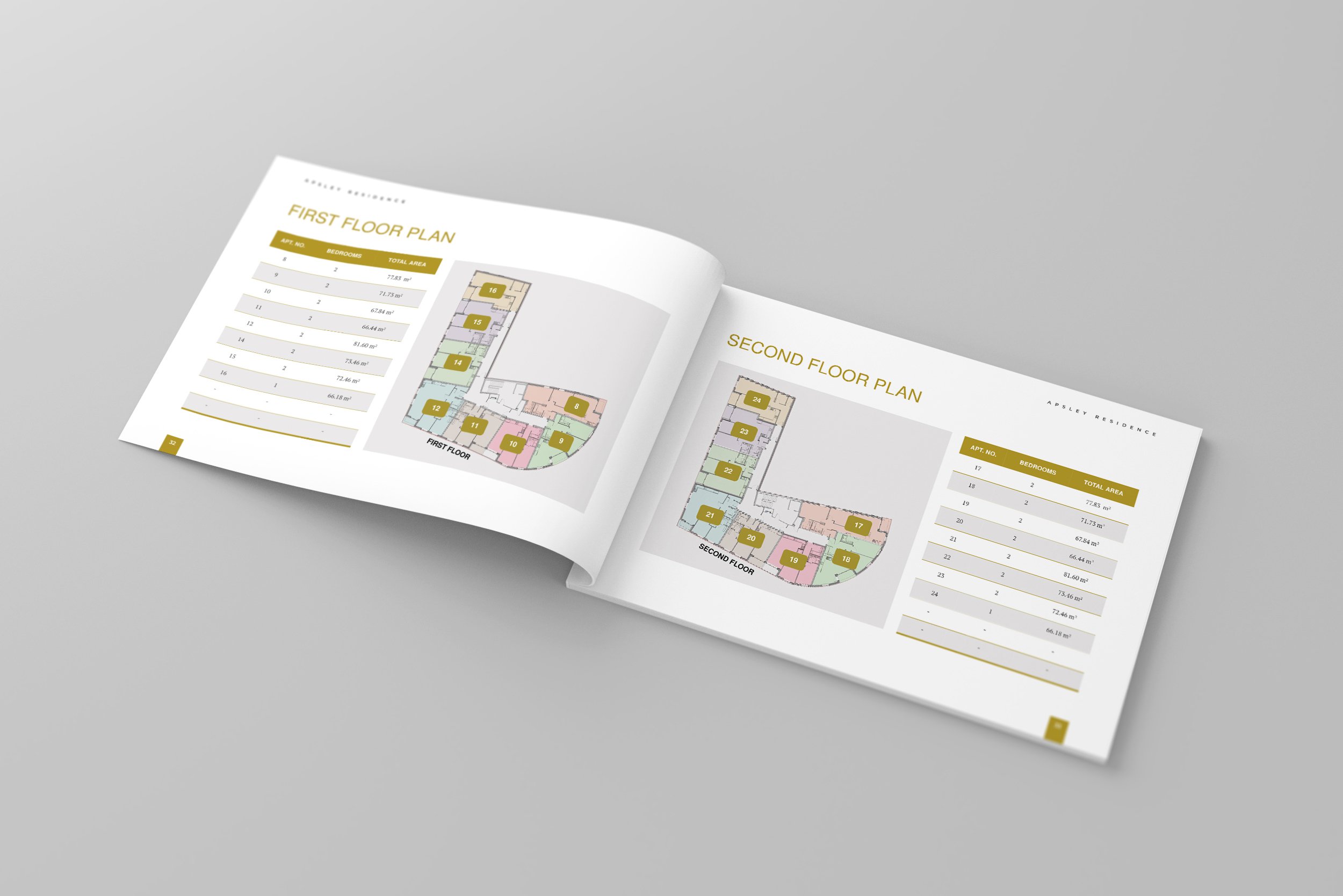
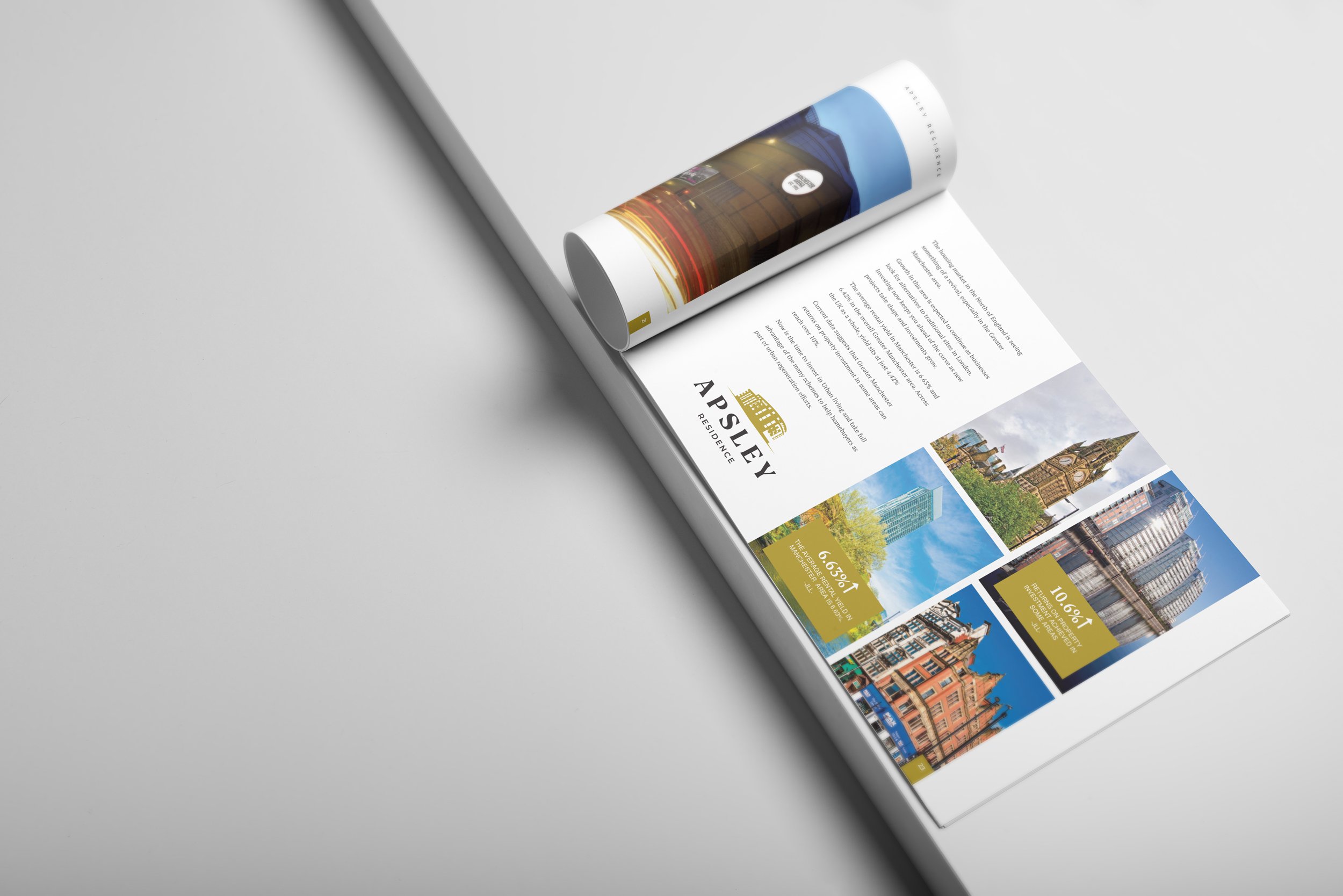
The colour scheme continued throughout the brochure, and the text was presented in small blocks to make it easily digestible. It was interspersed with images, plans, maps and diagrams that provided quick to view information about the local area and the key draws that would encourage tenants into the building and increase revenue for investors.
The use of images of different sizes and uneven grids create an asymmetric view and add to the smoothness of the brochure and the ease at which the eye glides over the different information. The finished product was engaging, attractive and high-quality from beginning to end.
Our client was extremely pleased with the outcome and the open communication that ensured a smooth design process where everyone’s voice was heard. PPI acknowledged our patience and professionalism in their feedback.
