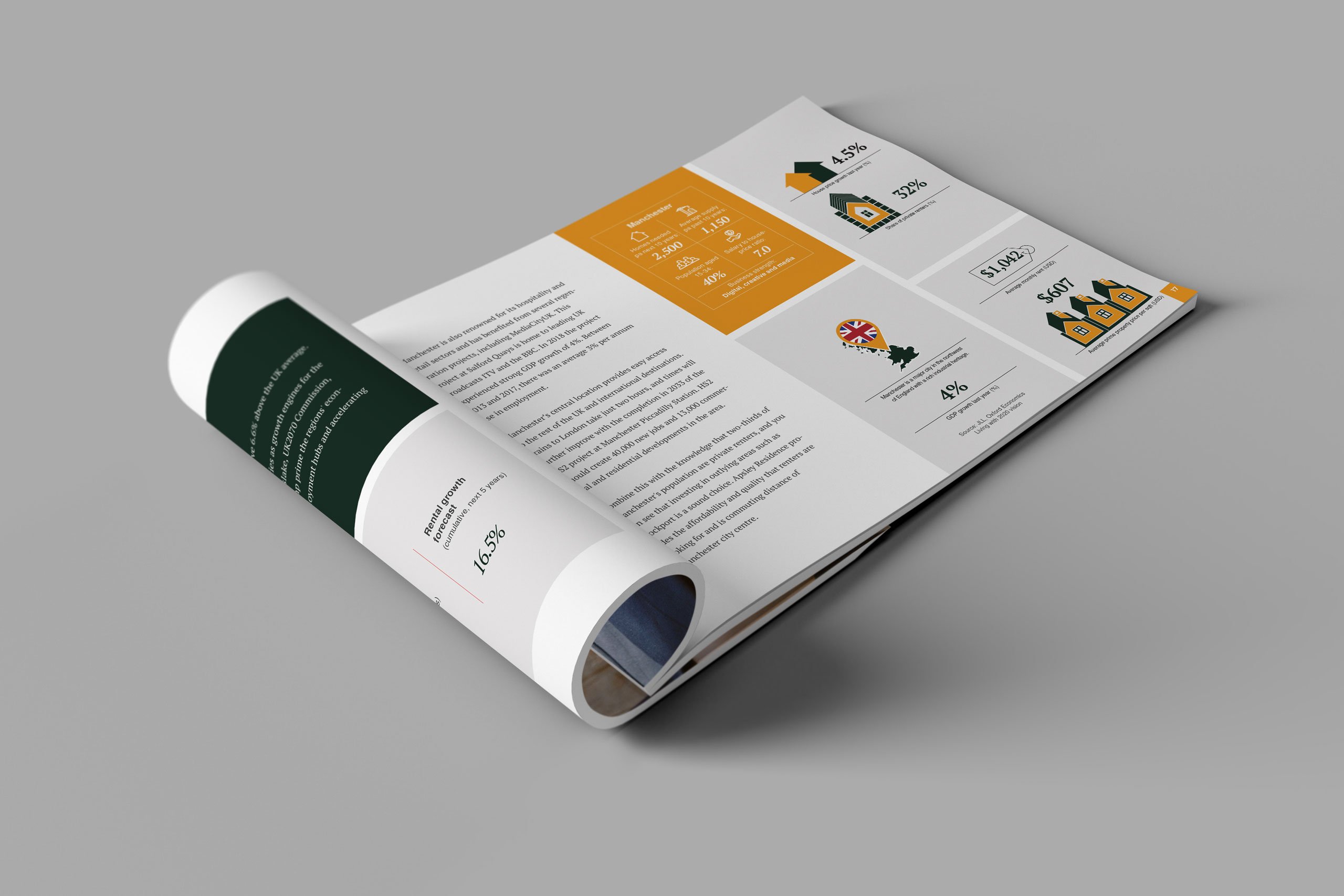
A marriage between history and a future-facing company was created through the colour scheme and the logo we designed for use on all their marketing and official papers. British Racing Green was chosen because it conjures images of heritage, history and quality. It gives a nod to the past while taking what is best about it into the future, providing a firm foundation to build on.
The logo is a stylised version of the building itself. The simple lines and curves are reminiscent of the Art Deco design of the 1920s, a period of innovation and opulence, two words that describe the company’s dwellings and image.
