Corporate Logo Design
The Agency
With a significant presence in the construction sector, Watson Safety is very proud to have given back over the years, donating time, workforce and equipment to a range of good causes.
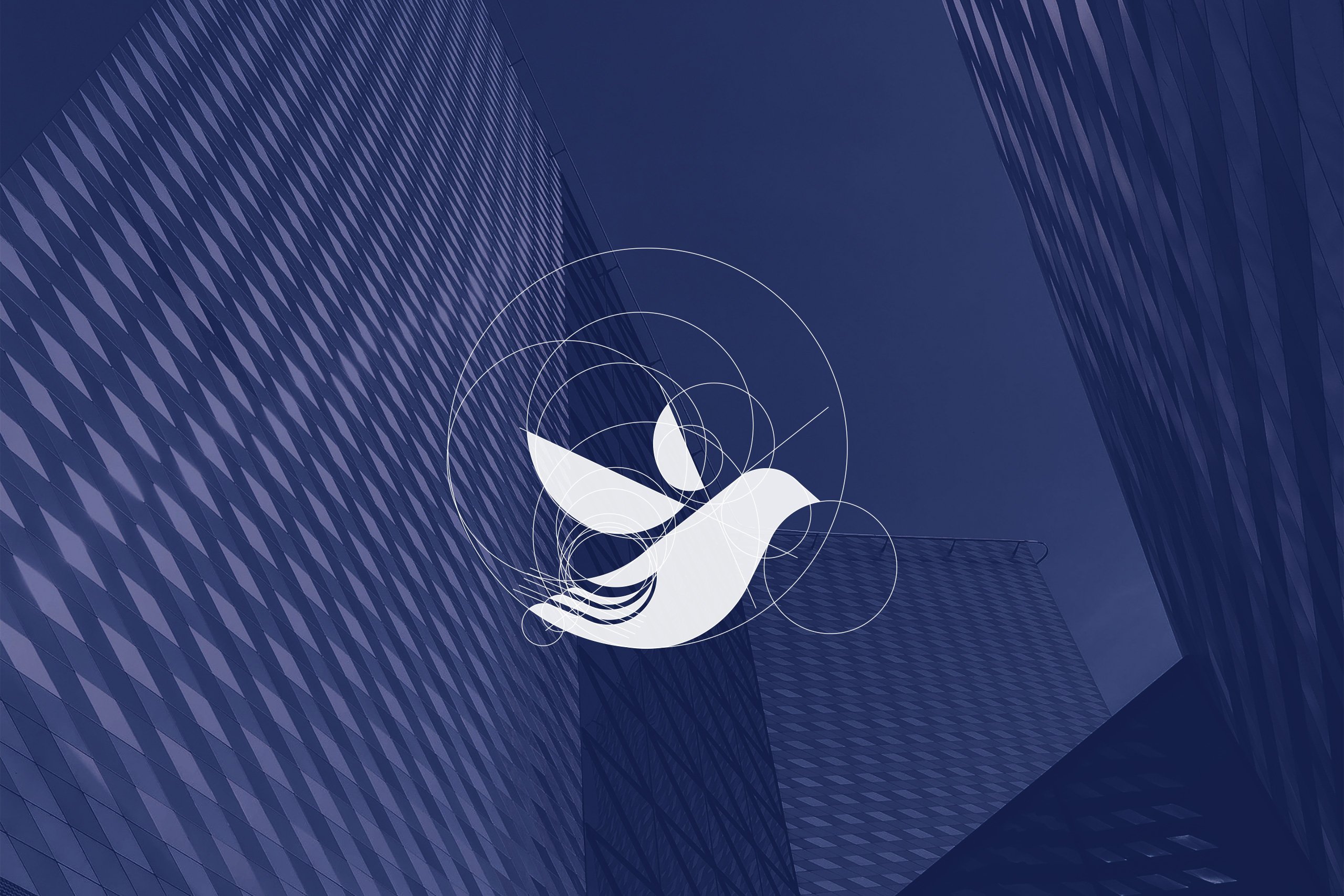
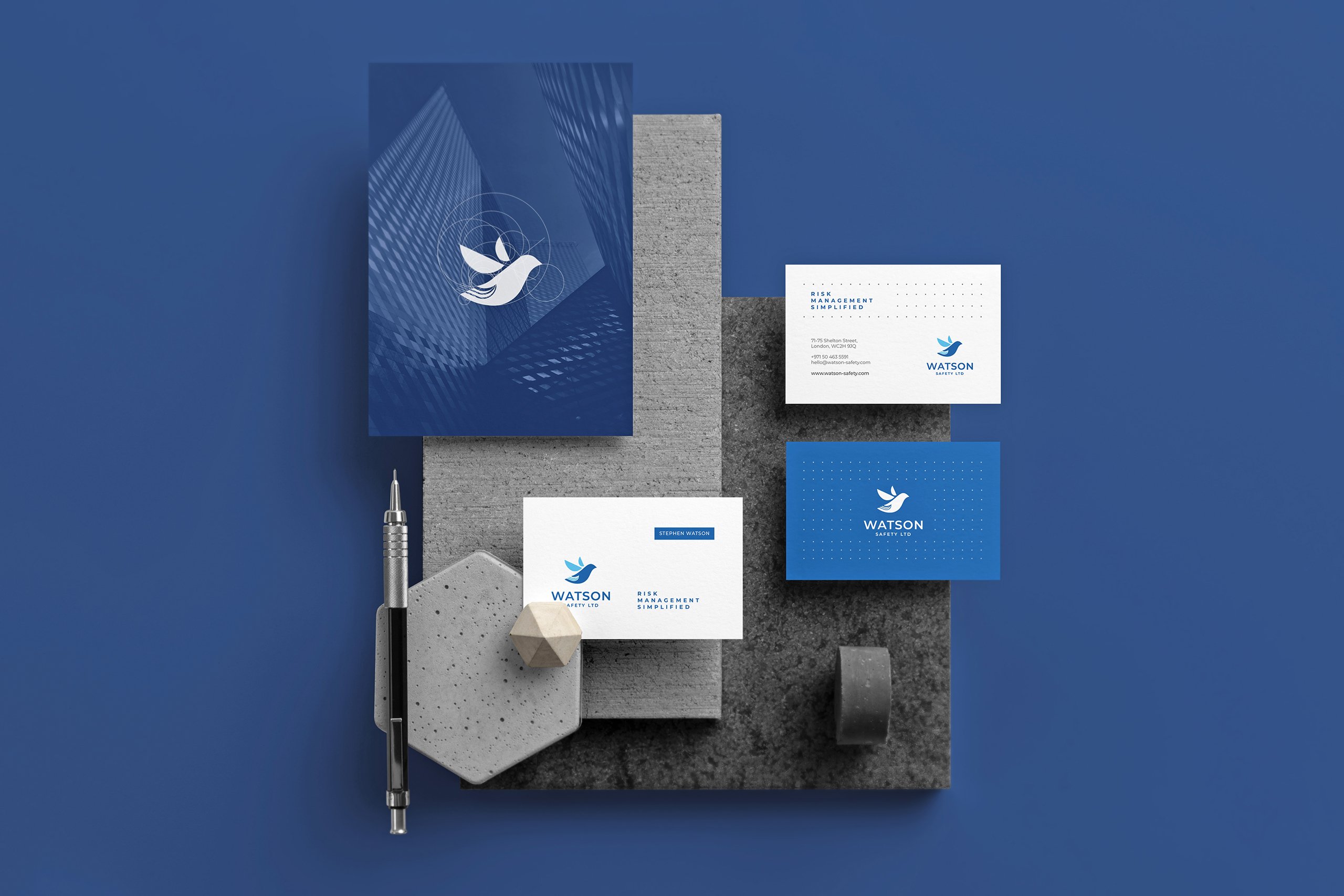
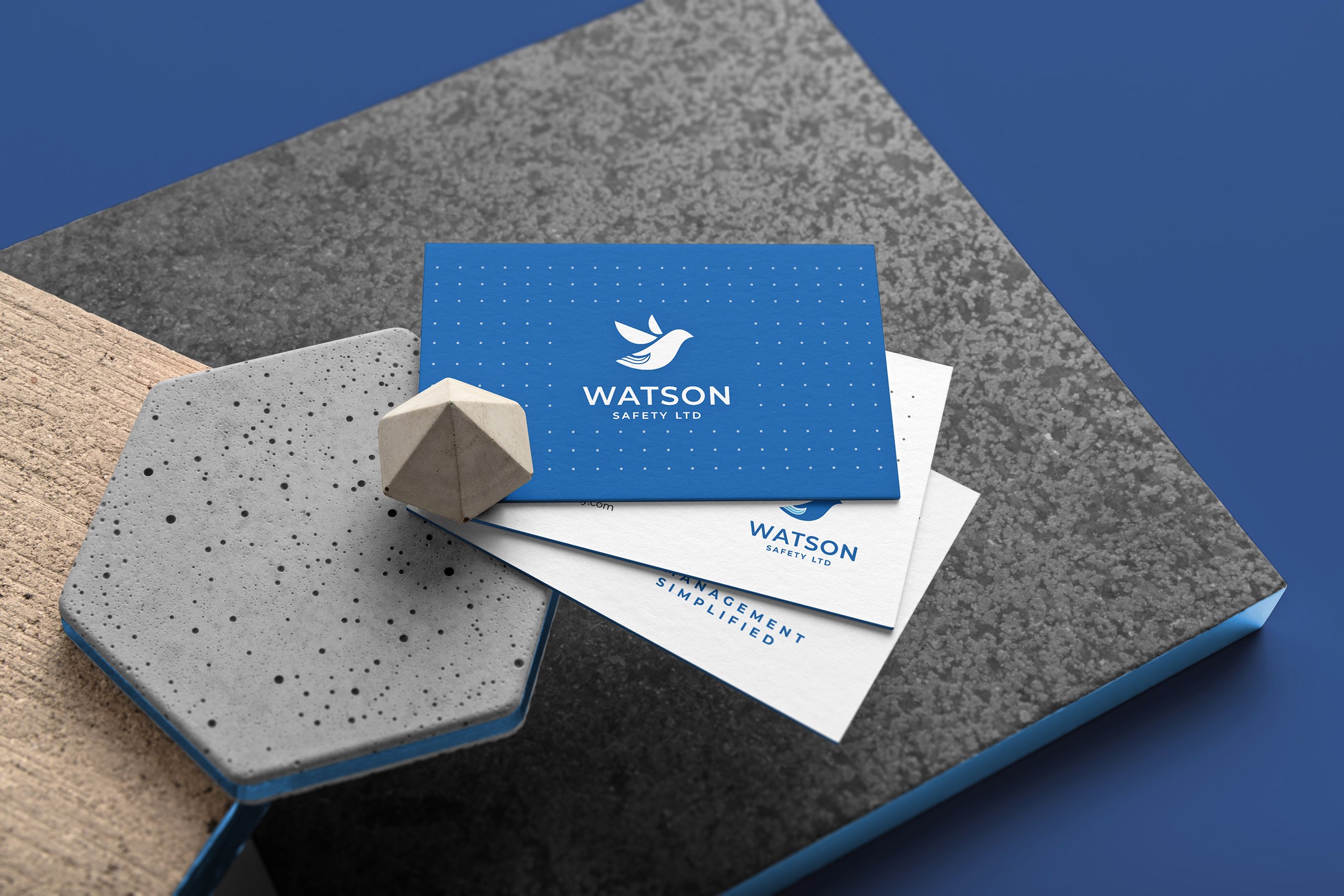
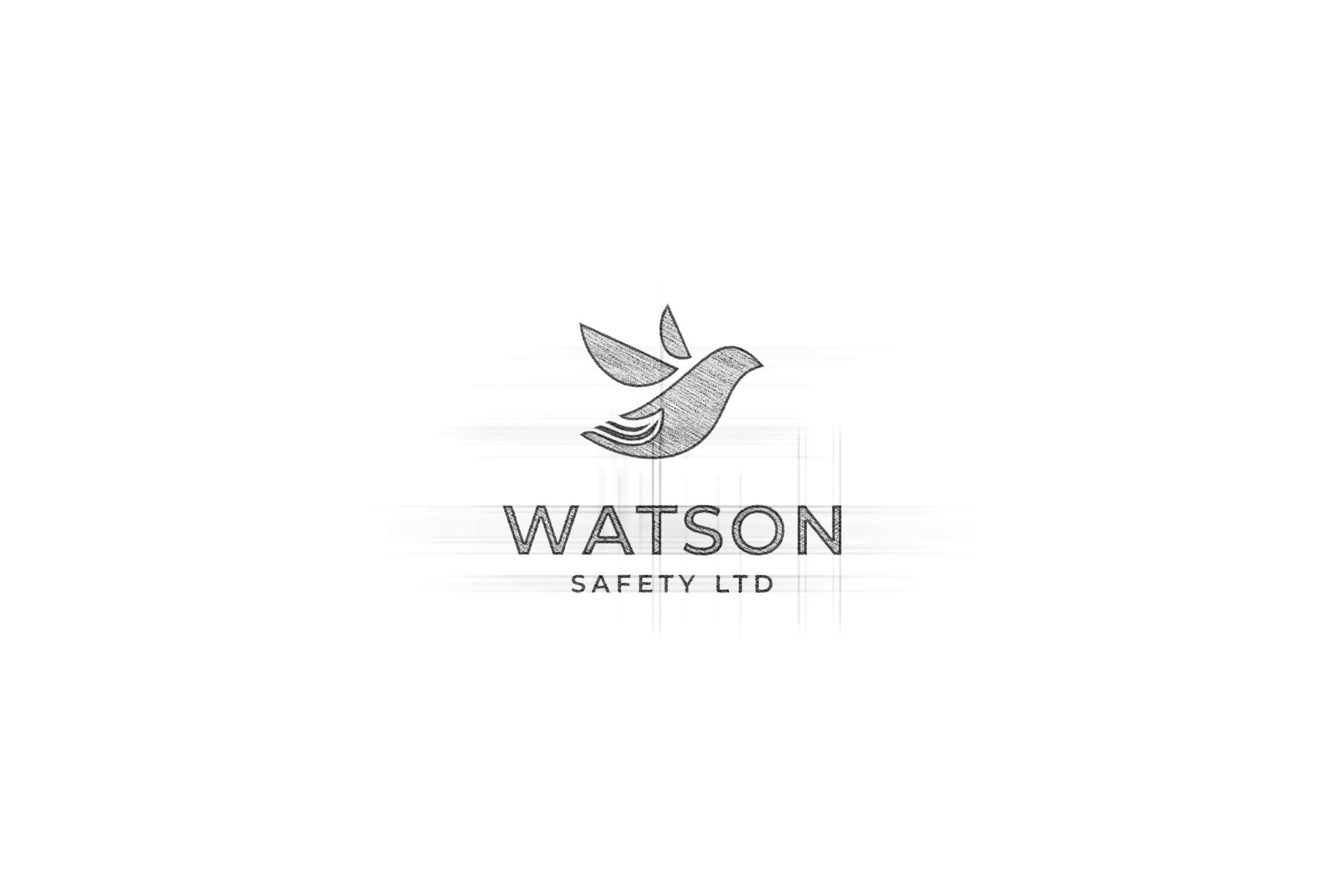
Watson Safety approached Creative Harmony to create a brand identity and brand guidelines for its business. Our creative team wanted to draw the different aspects of the company and its offerings together. Using the Golden Ratio as the basis for the logo, the team created something pleasing to look at, connected the viewer with something greater than themselves, and which could hold a hidden image and meaning.
Initial Sketch
The Outcome
The dove is synonymous with peace, love and caring. It creates thoughts of calm after a storm, soothing the troubled mind and finding greater rewards. Hidden within the image is the hand. It too has numerous meanings, but when associated with the dove, it brings trust, peace of mind, protection, strength and a sense of prosperity, all things the company wants to be associated with.
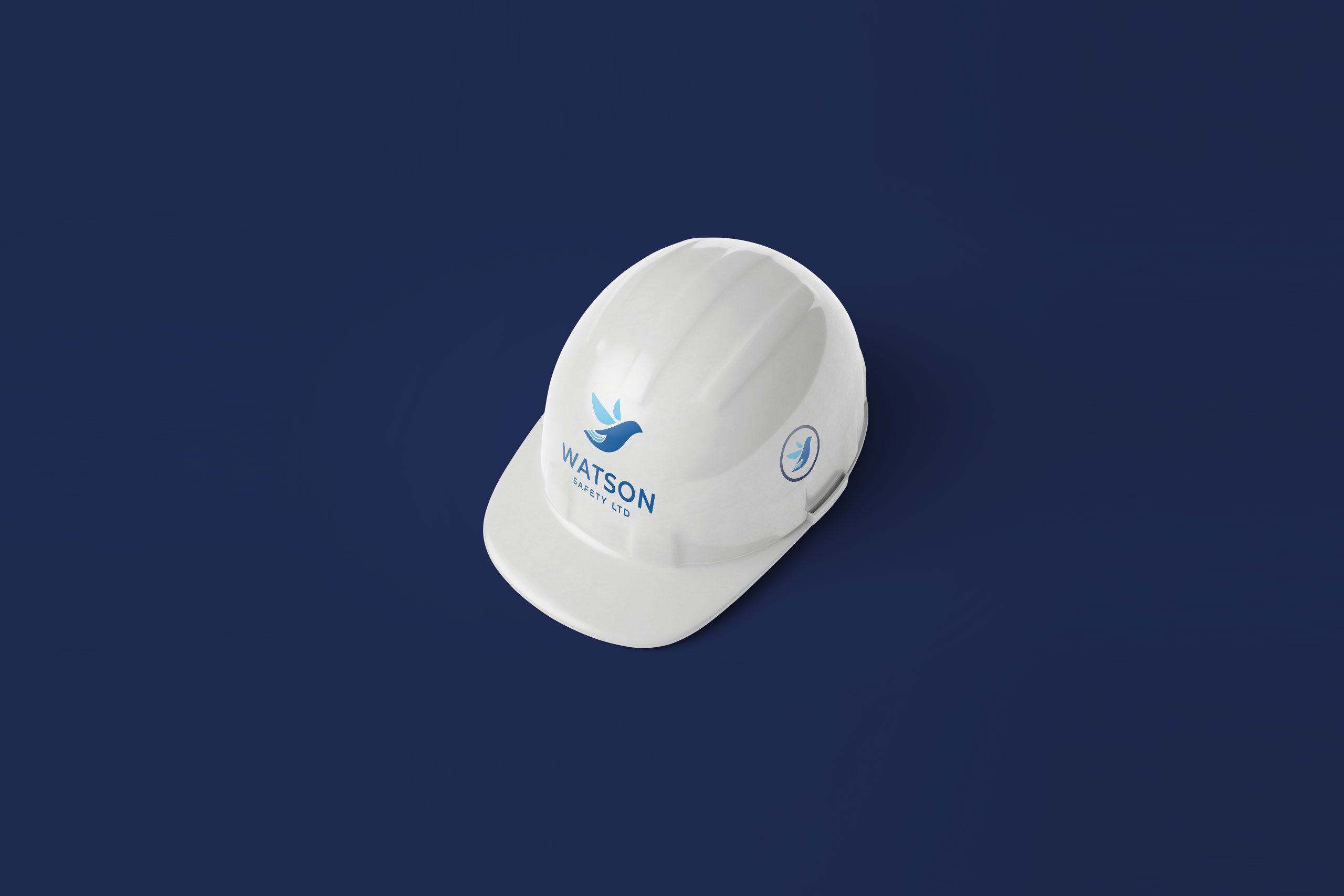
The dove sat ideally with the company’s colour scheme and new brand guidelines. It helped draw everything together and created a focal point on which to build the rest of its marketing streams.
The Application
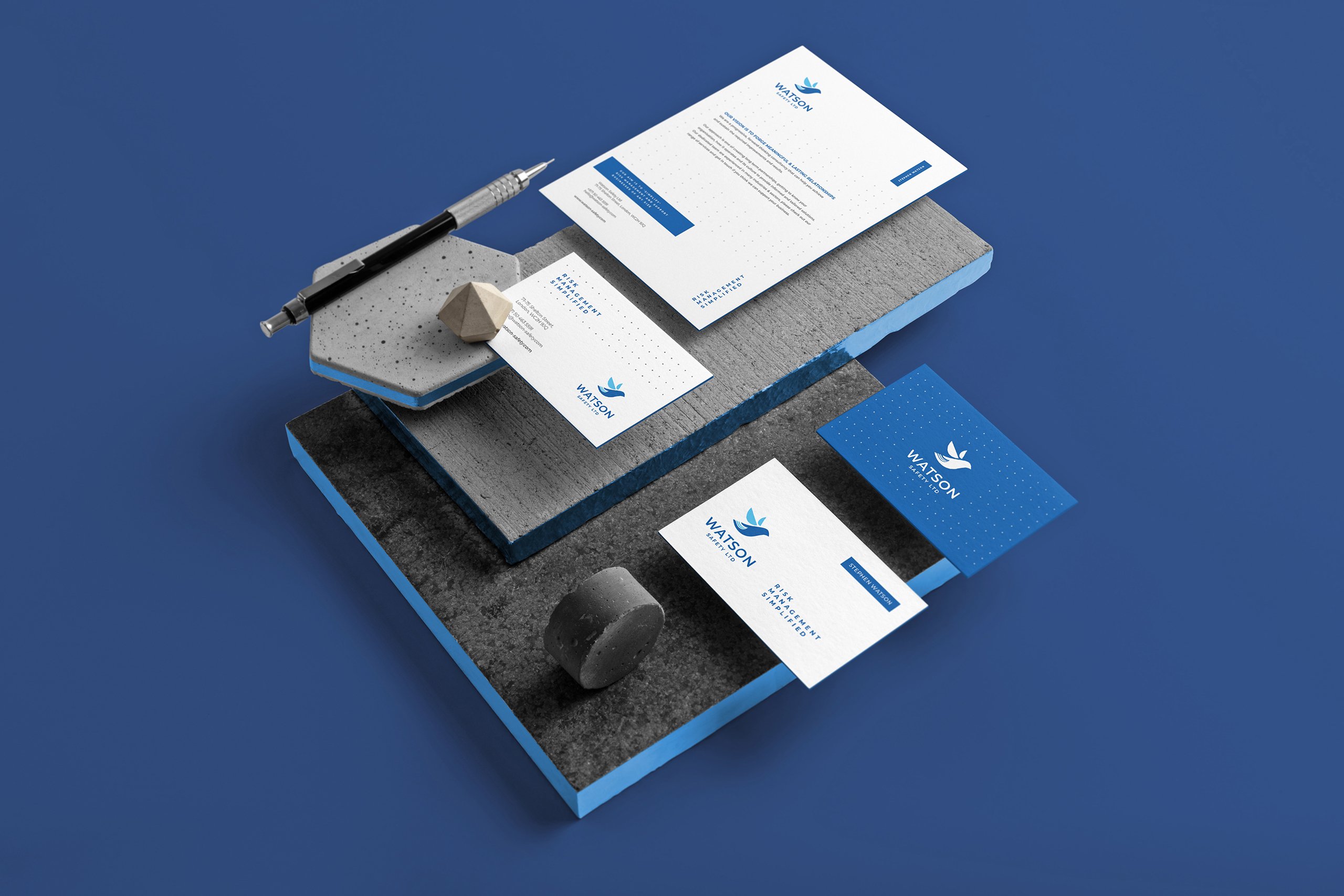
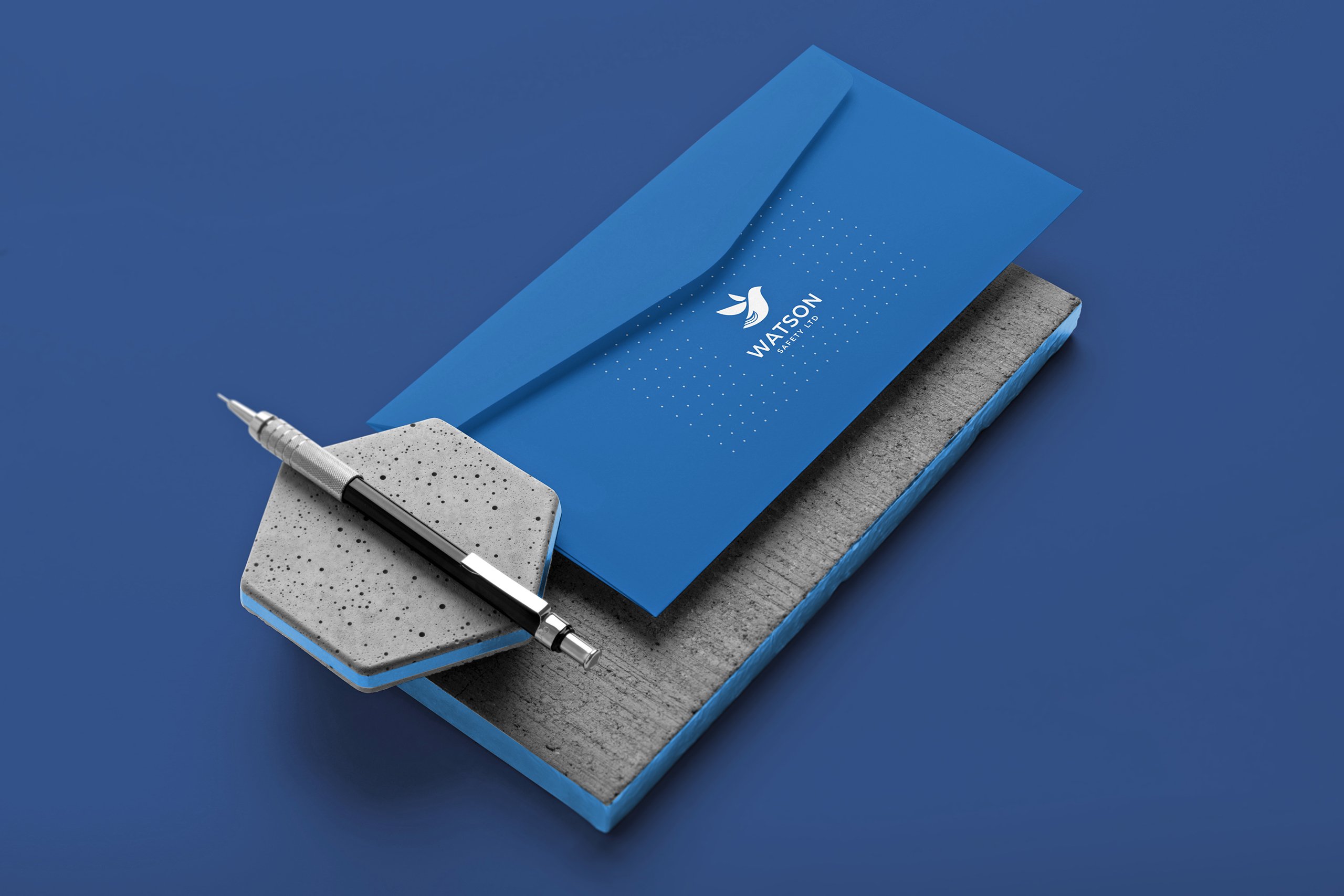
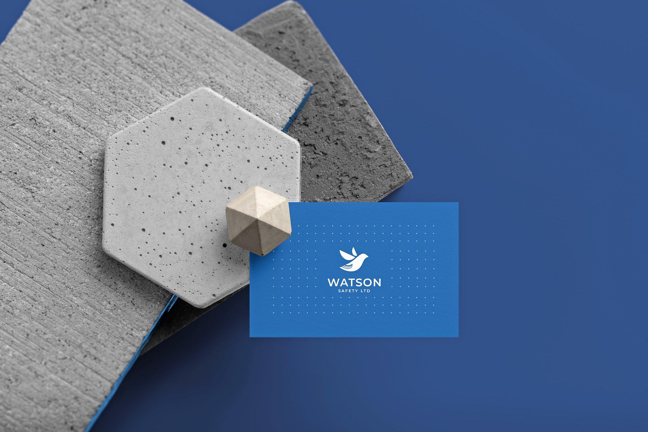
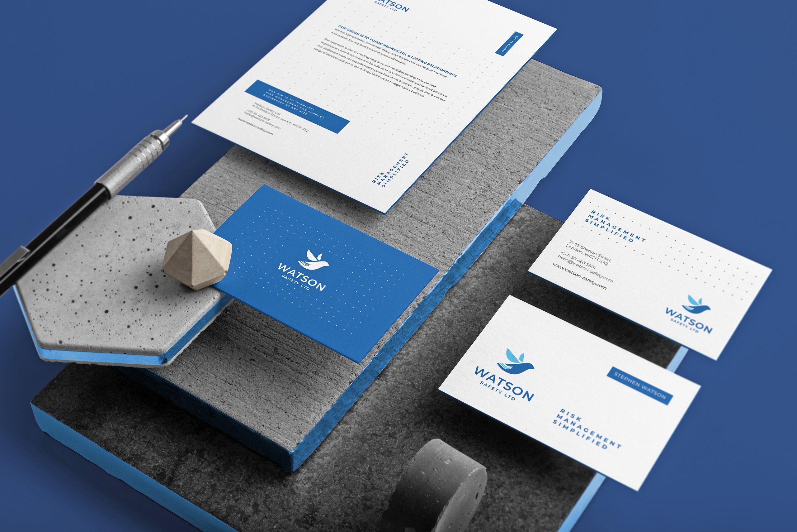
The logo was exceptionally well-received, and we created a set of brand guidelines and stationery to go hand in hand with the logo.
Following the success of the brand guidelines and the logo, we were asked to create a brochure and design the company website. We worked with the company to ensure that both projects went smoothly and that the company’s vision was brought to life. The result was a fresh, clean website that was easy to navigate and provided a great user experience.
Testimonial
We have been working with creative harmony for some time on several projects, they are extremely professional, responsive and flexible to our needs.
They provide constructive feedback to ensure the final product exceeds our expectations and is of fantastic quality.
I have no hesitation in recommending this company for your logo, brochure and website requirements.
Stephen Watson Director – Watson Safety Ltd
Final Thoughts
The brochure provided a visual connection to the company. It was designed to be easily accessible and provide the reader with everything they needed to know about the company without overwhelming them. We ensured that the logo and the colour scheme remained constant throughout the project, drawing the diverse elements together.
Want a logo designed by professionals?
Need a professionally designed logo and don’t know where to start? No time spare to use a design-it-yourself app. Tried a logo app and not happy with the result.
You need an award-winning design agency that takes care of every aspect of logo design, from conception to creation.
We’ll provide you with a logo looks fantastic AND delivers on its promises, whether that is creating:
-
Improved Sales and Brand Recognition
-
Increased Brand Awareness
-
Clearly Communicating your Business’ Values
