Brochure Design Ideas & Inspiration for 2022
Most designers have created a brochure at some point in their careers. The chances that you will need to design another one in the future are pretty high. It may be for a client or to promote your design business. Either way, creating a brochure is a specific art form.
It is an art form that comes with its own unique challenges. One is that you are not just designing for print anymore. Digital brochures are becoming increasingly popular. Many clients now request a sharable digital design file alongside the printed version.
The challenge is not impossible though, and there is plenty of support out there. If you are new to brochure design or need a little inspiration, look no further. Whether you want classic tips or modern looks, we have put all the best ideas in one place.
Common Brochure Shapes and Sizes
Size, shape, medium and folds are the first considerations for any brochure design. Not only do these affect the look and feel of the brochure, but they affect your overall design style, printing options, and how images, text and other elements come together.
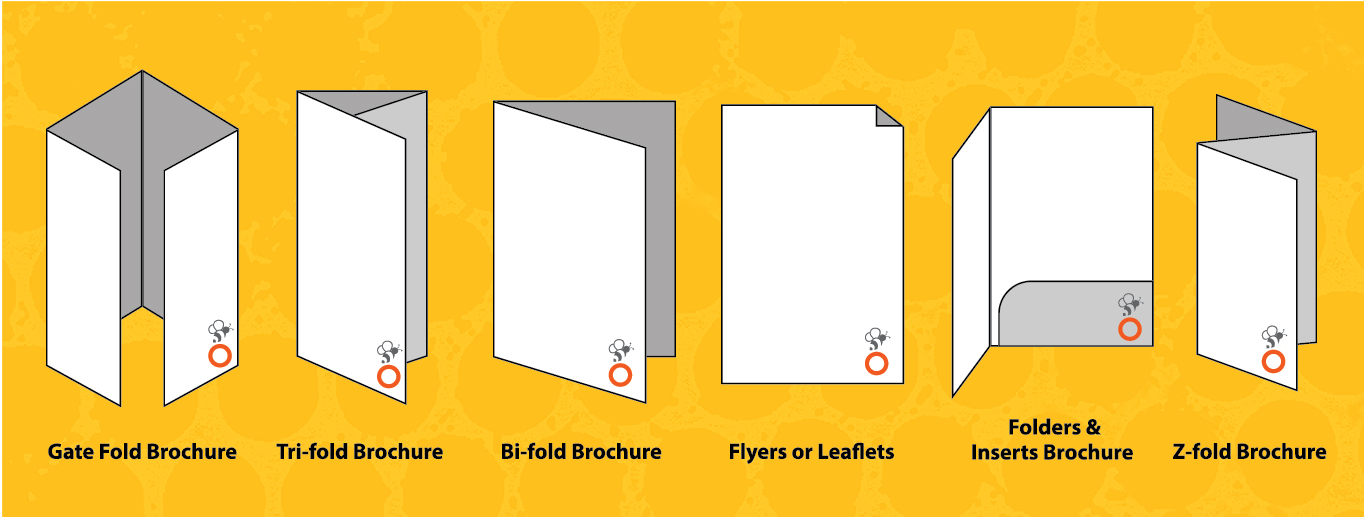
Common options for brochure creation include:
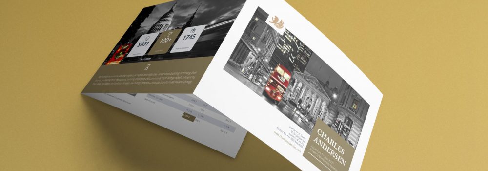
Tri-fold: Gives you three panels on the front and back. These can be stacked horizontally or vertically and are usually printed on standard paper sizes like A4 (8.5 inches by 11 inches) or A3 (11 inches by 17 inches).
Half-fold: This gives you a front, back and inside spread that works well as a mini booklet.
Multi-page: There is a fine line between a brochure and a booklet. The more pages, the more likely it is to crossover into being a booklet. A4 (8.5 by 11 inches) is the standard paper size, and some binding is usually included.
Square: This option can be more expensive but has become more popular through its use online. Square design can be attractive and usually includes custom paper sizes.
Die-cut: These brochures are characterised by having multiple cut out elements, meaning that some part of the brochure isn’t rectangular. They are come in a range of sizes and shapes and are usually printed on thick stock.
With brochures increasingly living in both the print and digital worlds, designers must consider the needs of both. Some styles adapt easily to the digital world and need little to no adjustment outside being converted to PDF. Other styles, such as tri-fold brochures, can look strange when presented digitally.
When shifting a print brochure to digital, think about producing each page or fold of the brochure as a separate digital page. Order the pages as they should be read to make the brochure easier to read regardless of format.
Creative Brochure Design Inspiration
Get creative with your brochure design by using textures and effects.
Foil: Shiny lettering or feature on a specific area of the design
Letterpress: Printing process that creates an imprint on designated areas of the brochure
Spot UV: A special matte or gloss finish on any of the brochure design
Folds: Get creative with different and exciting fold patterns to capture the reader’s interest.
Paper: Different paper textures and types can help set the right tone for your brochure.
Die Cuts: Create a sense of mystery by including cut-outs so something different shows through.
Modern, Trendy Styles
Simple images, sleek typography, and high colour are a few of the key trends in brochure design. Brochure design follows many of the same trends as other design areas.
Trendy, modern design techniques that always make brochures look fantastic include:
Using white space creatively. Including whitespace that’s not actually white but instead uses another bold colour.
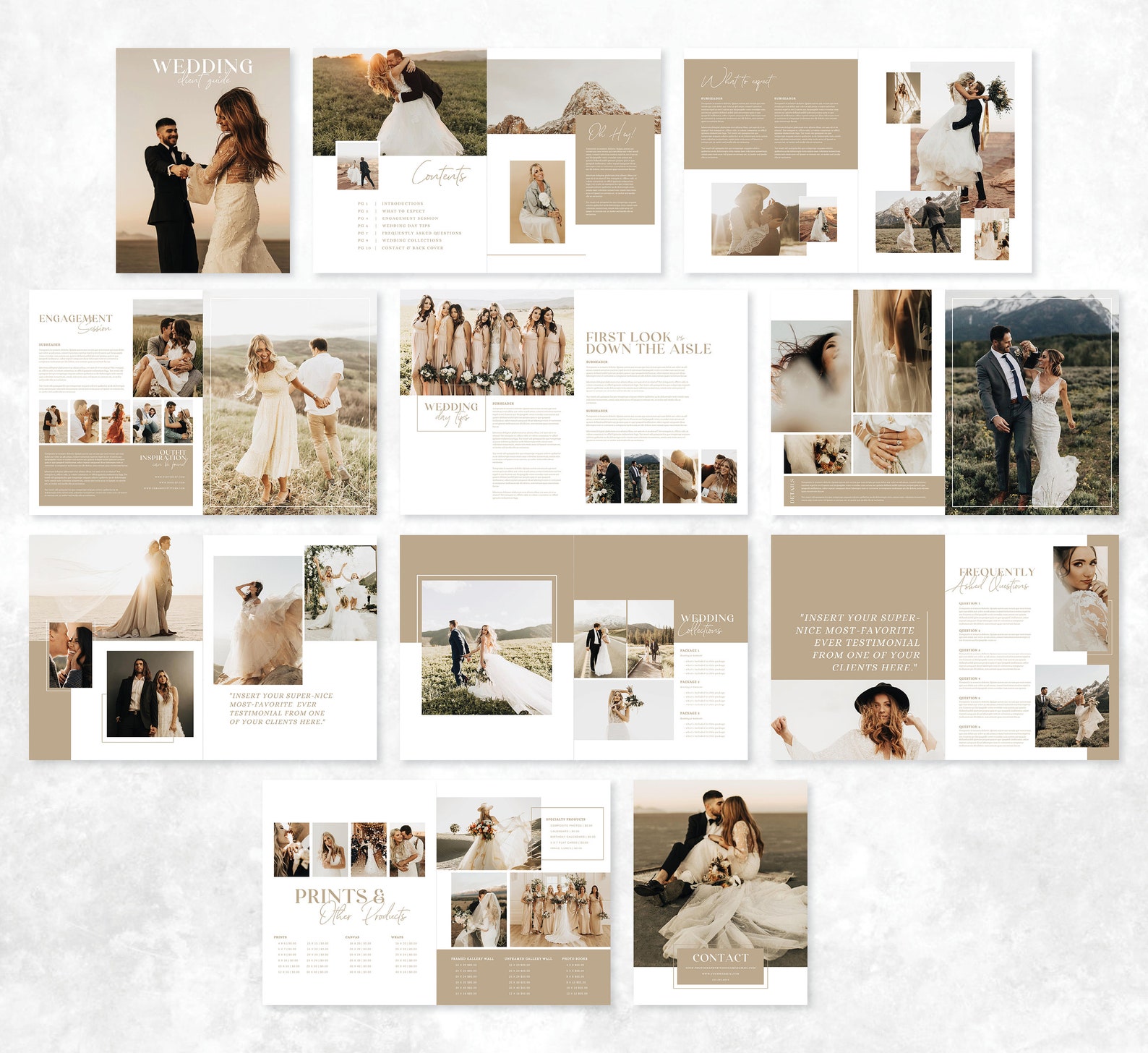
Mixing fantastic imagery with straightforward typography to create elegance with a few beautiful effects.
Minimal aesthetics with an abundance of white space.
Using High colour designs, such as colour blocking on alternating panels, pages, or folds.
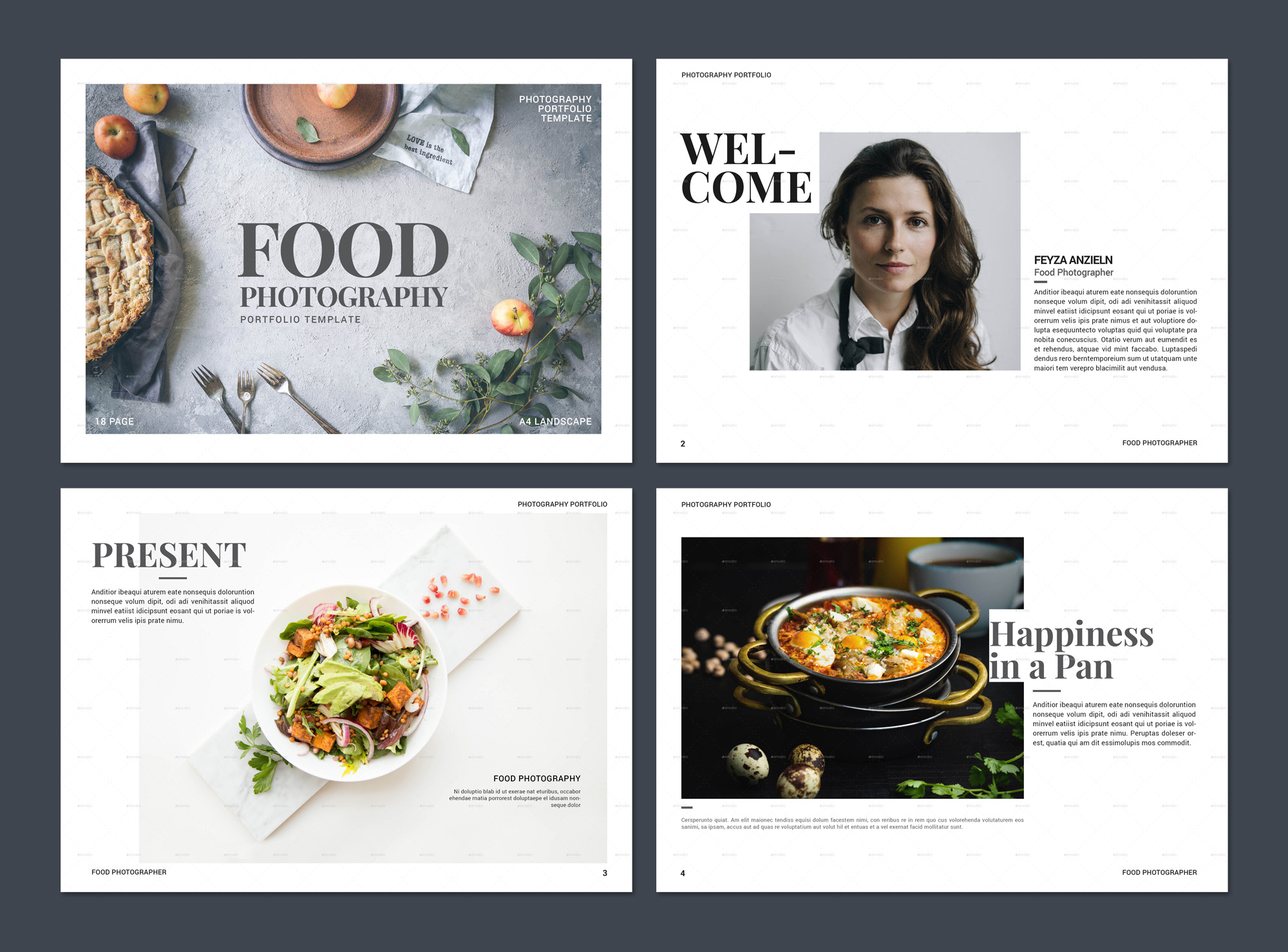
Making the lettering a core design element by using oversized typography.
Geometric Shapes
You can lead the eye through the design with the right shape combinations. You can make your brochure design pop by using geometric shapes effectively, including on the cover. They also serves as a primary visual aid or help create focus on important content.
Pairing geometric shapes with a monotone colour palette creates a unified and trendy look and feel. Smaller or black and white images with geometric shapes help make sufficient visual impact to carry the design.
If you are working with geometric shapes, opt for a consistent shape throughout the design. Contemplate various options like outlines or filled shapes to add a little extra sparkle.
These brochure designs can be used individually or as one element in the overall design. The important thing is to choose features that work together and clearly convey your message.
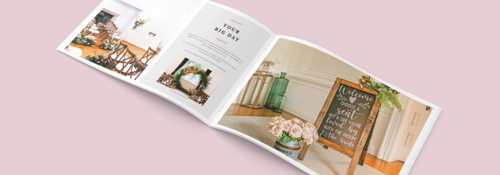
Landscape Orientation
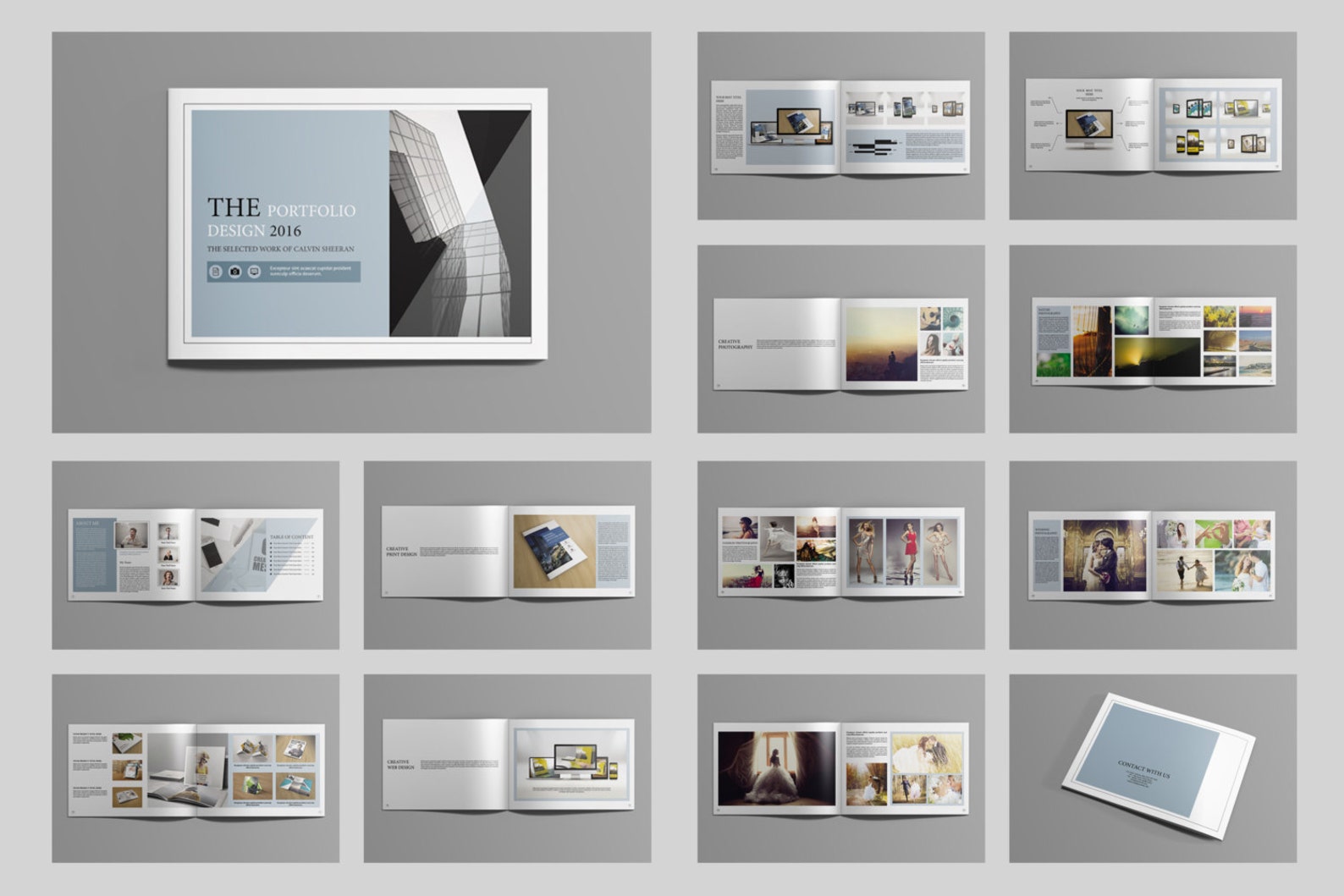
Publishing techniques, paper usage and page orientation, are among the most trendy and modern parts of print design. Portrait-style brochures may be standard, but using landscape orientation can make your brochure design stand out a little more and provide a different tactile experience.
Consider your images and content before settling on landscape orientation. The brochure will look awkward and lose its edge if you force the concept with the wrong style or content.
Landscape orientation can work exceptionally well as digital format PDF brochures. This is because the pages mimic the orientation of a desktop screen.
Bold Colour Choices
Colour choice and composition are essential and can be complicated for brochure design.
It requires the right mix and printing processes to get stellar outcomes from bold colours and bleeds. Mixes and folds require particular care to ensure the desired design every time.
Bright hues and neon colours are very popular. They make your brochure stand out and add an engaging, fun element. Bold colour choices aim to capture your audience’s attention and keep it once the brochure is picked up.
Turning your Portfolio into a Brochure
Make an impact by turning your website or portfolio into a printed brochure.
Your main goal is to create the right impression, and there are many different ways to achieve this. Showcase pieces and work that look fantastic in print. Leave this tangible item behind at job interviews or networking events.
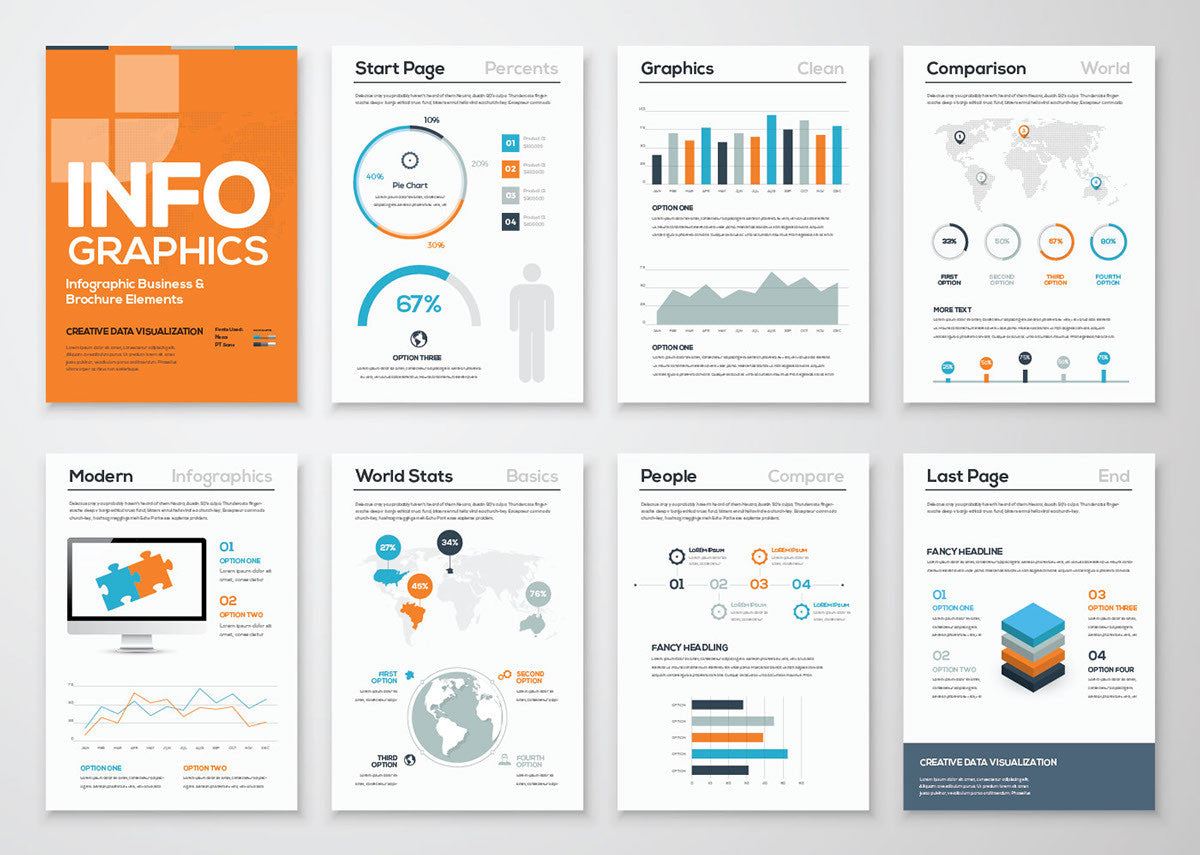
Infographics with Flow
Infographics are highly engaging and visual, making them perfect for quickly explaining your message in your brochure.
There are two options:
Detailed with in-depth graphics.
Or simple with graphics and images that convey meaning.
Either approach is effective in the proper context and helps provide energy and understanding. Infographics in brochures can stand alone or be one part of the overall design plan.
Highly Visual, Image-Based Designs
Highly visual elements with colour and images is a definite trend in brochure design. These elements are most popular with digital-only brochure designs.
However, high colour and high image designs can have a significant impact in print. Work with your printer to ensure images, colours, and bleeds will work effectively with your printing and paper selections. Be prepared to adjust your choices if needed.
If you use a lot of imagery and colour, don’t go for anything overly complicated. They should communicate a single message and be easily understood.
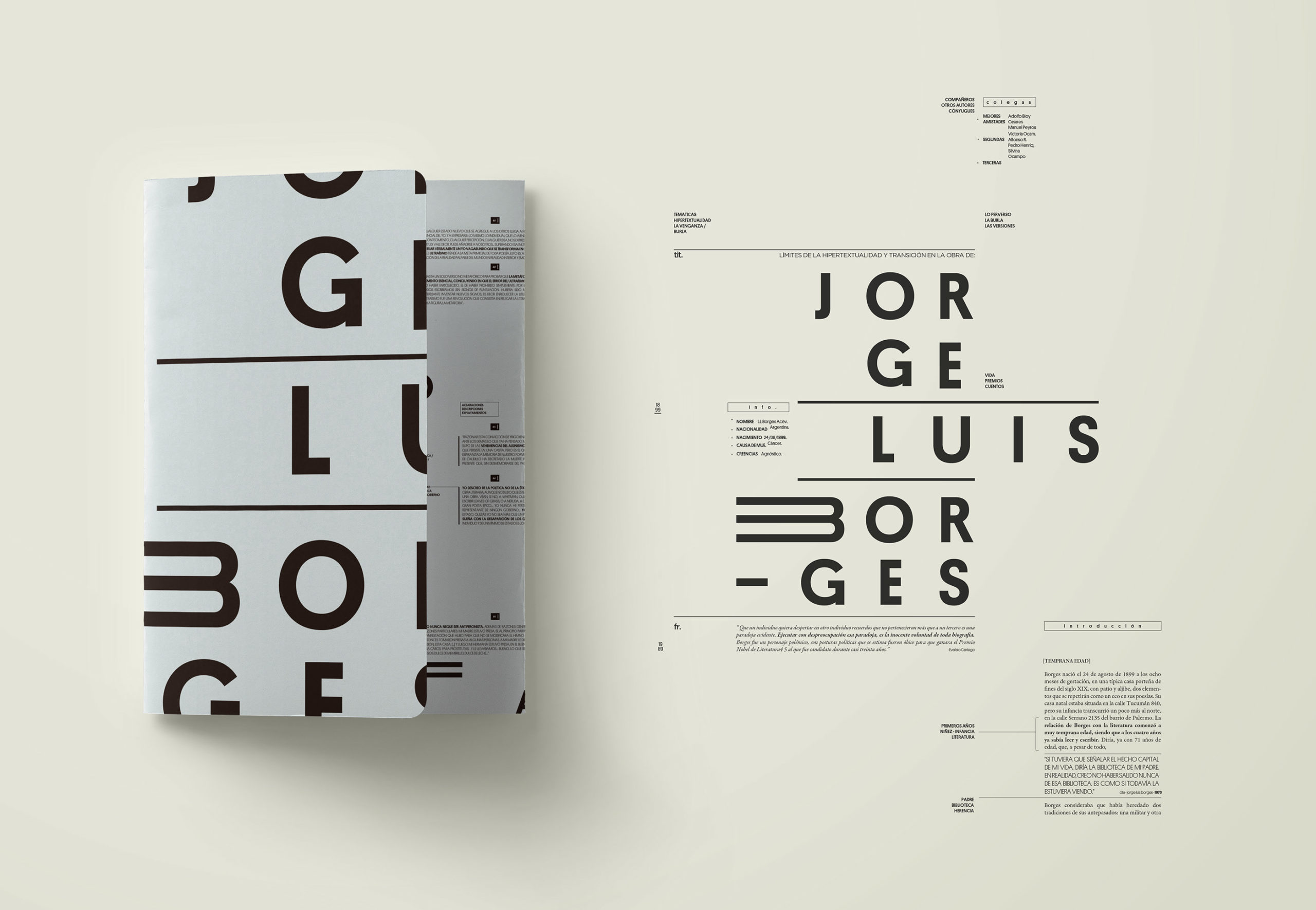
Typography-Driven Brochure Design
Big type is an excellent way to handle brochure design without including many images or other art-based design elements. Oversized, fun lettering can significantly impact and help readers know what your brochure is about.
For best results, get creative with your word creation and type choices. Using different alignments, colours, tilting, and attractive long word breaks (like, one syllable per line) add a significant visual draw to the lettering.
Ensure you include sufficient white space if your design features lettering only. Ensure the eye moves through the content easily using a defined type hierarchy.
Minimal Design is Great for Printing
Less is definitely more when it comes to printed brochures.
One of the reasons that minimal design styles are prevalent among brochure designers is because there’s less to go wrong with printing and quality control. You don’t need to worry about readability if you avoid reverse type (light text on dark backgrounds). There are fewer concerns about ink smearing if you go for canvas or white backgrounds.
There is more choice in paper stock if you go with minimal styles. Lighter weight papers become a viable option when less is going on with the overall print job.
Lastly, minimal design styles never go out of style, spanning the space between classic and modern.
Conclusion
Are you ready to get started? At Creative Harmony, we have all the tips and expertise you need for the perfect finished brochure design. We can provide brochure design templates or the completed job, just as you envisioned it. You can see relevant examples of our work Property Development Brochure Design and Recruitment Agency Brochure Design.
Creative Brochure Design
Creative &, hard working design for brochures, reports, prospectuses & newsletters. Marketing literature that creates excitement with outstanding design and stunning visuals. Brochures are still one of the most important sales tools for promoting your company’s message and will help to set your customer on the right path to engaging your services or making a purchase. Click here to find out more.
