How to Create a Brochure – a Step-by-Step Guide
You’ll have received your share of brochures over the years, and the chances that some will have gone straight into the bin, while others have made you stop and read. Perhaps a few have even resulted in you taking action, whether that’s making enquiries or buying what the brochure’s promoting.
When it comes to creating your own brochure, it’s obvious which category you want it to fall into. But how do you ensure that? What made the difference when you were the recipient?
There’s a lot to get right in a great brochure, but the principles are fairly straightforward. Here’s a quick rundown of what you need to keep your brochure out of the bin.
Planning Your Brochure
Before you even think about the brochure itself, you need to make sure you’ve done some basic work on your business. What’s your brand identity? What’s your message? And who is your ideal customer?
These are all closely related, of course, but it helps to think about each one individually, starting with your brand. A brand is essentially a reputation — how your company is generally perceived.
Many things go into that reputation, but your brand identity is crucial. This is the sum total of what your company creates to portray the image you want to your market. In concrete terms, this can cover the characteristic colours, designs and written style you use in everything from your website to your signage.
Closely related is the message you’re trying to get out. All the elements in your brochure, or any other communication, are going to depend whether you want to be seen as traditional or futuristic, seriously professional or fun. Perhaps you want to emphasise that you’re reliable or socially responsible. It all affects what kind of brochure you’re going to put out.
Besides knowing clearly what you’re saying, you need to know exactly who you’re saying it to. Identifying your ideal customer for the campaign should define the kind of information they’re looking for, whether they respond better to text or images, what kind of tone will engage them more and the best way to get their attention.
Designing Your Brochure
There are many elements that have to be right in your brochure’s design. Bear in mind what you’ve established about your brand identity, your message and your ideal customer. All your choices — brochure type, colours, images, text — will need to be consistent with those requirements.
One of the things this means is ensuring that the key information you need to get over, such as your address, phone number and email, is going to be easy for your ideal customer to find. That may affect the size, placement and colour, but it may also be important to avoid large blocks of text.
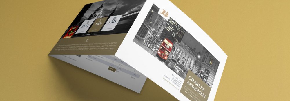
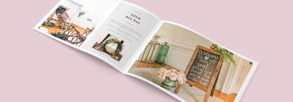
You’ll also need to consider the type and size of brochure that would come over best. There are numerous types, from a basic trifold to more complex configurations like double gate fold or accordion fold. The decision may depend on how much information you need to fit in, but it may also be determined by who your reader is. Will they appreciate a complex journey through the brochure, or would they prefer something simple?
You can also use brochure mockups to showcase your brochures on your social media campaigns or your website.
One of the determining factors for size is how you plan to distribute the brochure. If you’re going to mail it, remember that a larger brochure will increase the costs. If someone’s going to hand the brochures out in the street, it would help if they’ll fit easily into the average pocket.
The Elements of Your Brochure
- Graphics and photos — Images and photos are likely to be what first draws the attention, especially the cover photo, so it’s vital that they’re high quality. This isn’t an area to save money by taking snaps on your phone — you need professional quality. Make sure you have software that allows you to crop and mask, to change contrast and saturation and to align the image.
- Text — The text needs to be clear and compelling, written consistently in the tone you’ve identified as fitting your brand, message and ideal reader. Text on the cover should be designed to grab the attention, on the inside to tell a story, and on the back to give important information. Use enough text to engage the reader, but not so much that you bore them.
- Font — Keep the fonts you use clear and simple, and avoid anything too quirky, unless you’ve identified that as something your readers would relate to. It’s usually sufficient to have one font for the body text and one for the headings, preferably a complementary font (e.g. one serif and one sans serif). Make sure the colour allows the text to show up clearly against the background.
- Colour — Of course you’ll want to use your branding colours, but bear in mind that colour is closely tied to the emotions. Think very carefully about the emotions you want to evoke and choose colours that will fit that. There are a number of resources available online that will help you get exactly the right colours, such as Adobe’s Kuler and the Color Scheme Designer.
- Putting it together — You can have excellent components, but unless you make them work well together, it’ll look a mess. This particularly applies to the balance between the text and the images, and how you place the images to break up the text.
- Call to Action — Every element of your brochure should revolve around your CTA. Make sure it’s displayed so that the reader can’t miss it — preferably in multiple locations.
Printing Your Brochure
Once you’ve completed the design of your brochure and checked it carefully to make sure it’s doing what you need it to, it’s time to get it printed. While you might be tempted to save money by going for the cheapest quote, this could well result in a shoddy-looking product that won’t bring in the ROI that you need.
A good printer will be able to advise you of your options, but here are a few things you should be discussing:
- Paper weight — The weight of the paper will be a trade-off between quality and cost-saving, especially if the brochure’s going to be mailed. However, it’s important to remember that very light paper is unlikely to give a professional result.
- Finish — You can have your brochure matte, semi-gloss or glossy. The choice will depend on the effect you want your brochure to have, and the printer will be able to advise on this.
- Special effects — There are various ways of enhancing the look of your brochure, including foil ink to reflect the light, embossing of certain elements and UV spot (a shiny coating that can be applied to logos or headlines). These will cost extra, so you need to weight up how much they’re likely to increase the appeal.
- Full bleed — Unless you want a white margin around your content, make sure your printer offers full bleed — i.e. printing right to the edge of the paper.
Need to Know More about How to Create a Brochure?
Hopefully this has given you an idea of how to approach creating your brochure, but there’s a lot more you may need to know. You’re very welcome to get in touch with us for any further information. You may want to read about 5 Ways to Achieve Contemporary Ideas for the Best Modern Brochure Design.
You can see relevant examples of our work: Coaching Brochure Design and Energy Investment Brochure Design
Professional Brochure Design
An impactful, professional and creative brochure gives the right first impression to your clients, builds reputation and further enhances your company profile, services and reputation. Creative Harmony is a specialist in the design & publishing of promotional, coffee table and corporate brochures, annual reports, prospectuses, catalogues. Click here to find out more.
Want a brochure designed by professionals?
Need an award-winning brochure design agency to take care of everything from brochure concepting to printing? No time for those design-it-yourself brochure apps?
We’ll give you a brochure that looks good AND works hard to deliver what you need it to, whether that’s:
- More Sales
- Greater Awareness
- Communicating Your Values
Talk to our expert team of brochure designers today.

