How to Write a Brochure
Brochures are excellent marketing materials providing tangible information to potential customers in a primarily digital world. Glossy, four-colour brochures with persuasive writing and beautiful photos might be just what you need to increase demand for your products or services. Brochures can achieve several things, including introducing your business to potential clients and providing more detail on the services and products you offer.
Here is how to engage your customers and boost sales by creating an engaging and concise brochure with well thought out pictures and copy.
-
Be specific
You have limited space in a brochure, so everything you include must add value to the reader. Be specific about what you offer and how it benefits the potential customer.
Limit what you cover. Have a separate brochure for each service or product you offer. It is better to have multiple different brochures that to create one that is overwhelming and messy.
For example, if you provide custom services such as cleaning, dog walking and shopping. You may find it beneficial to have a brochure for each service and links to the other services that you provide. This enables you to concentrate on the specifics of the service and the benefits – the cleaning products that you use, how you tackle different rooms, your green credentials etc.
-
Consider the readers perspective
Look at your brochure with fresh eyes or, better still, get someone else to look at it for the first time. Ask what you would expect it to contain based on the front. What do you want to discover inside? What issues does it raise? What questions would you like it to answer? Does this fit your intended purpose?
Identifying your intended audience is just as important. Who would you like to pick up your brochure? Where are they likely to see it? What do they expect to find inside? Your content, tone and voice will be very different for board members and investors compared to individual shoppers or those looking to use your services.
If you’re explaining to a customer the benefits of a house cleaning or shopping service, your tone is likely to be lighthearted and focused on the benefits to their health and lifestyle. You want them to see your service as a way of improving their quality of life.
If you are looking for investors, your writing will be more facts and figures based. You want to show how your business will prove a good return on investment. If you’re aiming the brochure at potential employees, you may want an approach that sits somewhere in the middle, giving a professional business feel that also cares about improving the quality of life of those that work for you.
-
Focus on the benefits
Rather than giving a summary of your business’ basic features, focus on the benefits of your products and services and be specific. How does it save you time or money? Focus on a particular aspect or topic and go into detail about the features and how they help.
Include a FAQ section where possible covering common questions and provide helpful, knowledgeable solutions.
Your brochure is designed to be taken away by the reader and referred to later. Include relevant information that they can return to and find quickly. Done right, your brochure is your takeaway salesperson.
-
If it’s not relevant, leave it out
Fitting in everything you want to convey in one brochure is impossible. It is vital to determine what is most important and to leave out anything that is irrelevant. If it isn’t going to help sell the service or product, it doesn’t need to be included.
Crucial elements you should include are your company’s logo, company information, contact information and details on the products and services you are selling. A small section linking to your other products or services and where more information can be found can also be included.
Part 2 The Layout
How you layout your brochure is just as important as what you include in it. In this section, we cover the essential elements of brochure layout.
-
Layout choice
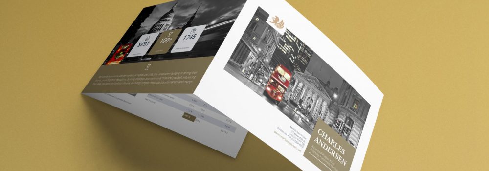
There are many different layouts and styles of brochure to choose from. The tri-fold brochure is the most common. Here is what you can expect from a classic tri-fold brochure.
- Landscape orientated paper is partitioned into six sections to create a tri-fold brochure.
- Your most important information is contained in the inside sections (sections 2, 3, and 4).
- The inside flap is section 2. It usually contains broader info with questions and answers. It is designed to compel the reader to delve further into the brochure.
- Expansion of this information occurs in sections 3 and 4. Here the information is explained in more detail, and the reader is convinced that your company solves their issues.
- The front cover is section 1. This must entice the reader into picking up and opening the brochure. It should include the company name, logo, a positive image and a line or two of text that makes the reader think or poses a question that reading further will answer.
- The back flap is section 5 and most often includes reviews or testimonials and coupons or money off codes.
- The middle back third is section 6. This is where you will find contact details, including phone numbers, web addresses and emails. It may also include a physical street address and a small map.
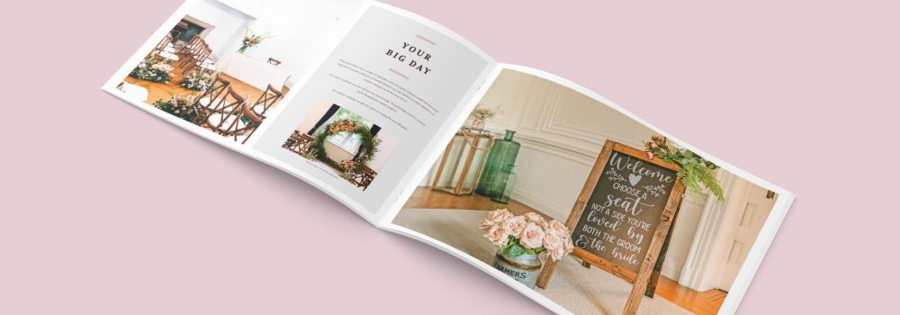
The amount and type of information you provide should be the primary guide to the layout and style you choose. Creating an outline helps you see how much room you will need for the copy and photos you wish to include. As well as the tri-fold, there are book or pamphlet style brochures. The layout of information should follow a similar pattern regardless of the style of brochure you choose.
-
Make the most of your space
Regardless of the layout or style you choose, make the most of the available space. You will need to find the perfect balance between words and images to achieve this aim.
- Written copy gives readers valuable information; however, filing entire pages with nothing but text is a mistake that will lose you potential customers. This is where images and graphs provide support.
- It can be tempting to reduce the size of your text to increase the amount of text. Don’t. If people struggle to read it, they simply won’t bother. Find more concise ways of saying what you need to say.
- Graphs, infographics and images offer valuable information, and small burbs can be added to them to provide further details.
-
Entice readers with your cover
Your front panel or cover needs to encourage people to pick up the brochure. The image here is one of the most important ones you include in the entire brochure. A well-taken photo showcasing your products or services should be included on your cover.
Keep text to a minimum and make every word count. Asking questions or leaving a sentence unfinished to be finished on the inside are two ways to entice your reader to pick up the brochure, but they only work if your words are well crafted and speak directly to the reader.
-
Create sections
Avoid large blocks of text that might intimidate the reader. Use headlines with bold text to break up text and create different sections. Short sentences and short paragraphs that contain helpful information are key.
Bullet points and numbered lists are another way of making information easy to digest. They also help draw the eye to crucial points.
Ensure that different information has its own section rather than cramming too much in one section. For a cleaning company, the various areas cleaned would go in one section, the products used would go in another etc.
Part 3 Creating the content
-
Speak directly to your readers and establish a direct relationship with them by using “you” to address them directly.
Avoid language that talks down to your potential customer while also avoiding jargon and unnecessary technical terms.
Begin and end your brochure with your customer, consider their potential questions and overcome possible objections before getting into the detail and showcasing all the great things you offer.
Focus on real-world solutions to your client’s real-world problems. Let them see exactly how your product or service would benefit them.
-
Keep your content client-focused
If you lose your treader’s attention, you are unlikely to get it back. Knowing your readership and writing for them is so important.
If you are trying to generate leads, add information that the client does not know about your business. Include a brief history and why you are better than your competitors.
However, if you are looking for sales, the chances are the reader already knows who you are, so omit this information or place it further on in the brochure.
Focus on benefits over offerings. Create a need that the customer didn’t even know that they had. Images are great for this as they can convey the benefits of your product or service in a way words cannot when space is limited.
Don’t get bogged down in the details that your customer doesn’t need to know. Focus on the finished product rather than the method used to get there. Your customers will benefit more from knowing you will leave their kitchen gleaming than they will from knowing the exact spray and wipe method your cleaners use.
-
Testimonials
Quotes from satisfied customers are a must. Include relevant information about the customer, including their full name, so your reader knows the testimonial is legitimate.
-
Call to action
Your call to action directs your reader to take the next step. This small piece of text can be the trickiest to write but is vital to creating customers. Be clear about what you want them to do next and create an emotional response in the reader. Adding an image here of happy people using your product or service is perfect.
Contact the Creative Harmony team to get your next brochure project in budget. Enjoy our high levels of personal service and commitment; we are with you every step of the way.
You can see relevant examples of our work: Multinational Corporation Brochure Design and Private Placement Memorandum Design
If you are considering a new brochure then it is not hard to guess a primary concern. While you might be concerned about quality, the brochure design cost is probably on your mind. You can read more about this here: How to Keep Your Brochure Design Cost Under Control and Get an Effective Product in 4 Effortless Steps.
Creative Brochure Design
Creative &, hard working design for brochures, reports, prospectuses & newsletters. Marketing literature that creates excitement with outstanding design and stunning visuals. Brochures are still one of the most important sales tools for promoting your company’s message and will help to set your customer on the right path to engaging your services or making a purchase. Click here to find out more.
Want a brochure designed by professionals?
Need an award-winning brochure design agency to take care of everything from brochure concepting to printing? No time for those design-it-yourself brochure apps?
We’ll give you a brochure that looks good AND works hard to deliver what you need it to, whether that’s:
- More Sales
- Greater Awareness
- Communicating Your Values
Talk to our expert team of brochure designers today.

