What is the Best Size for a Brochure?
A brochure is a superb way of promoting your business and reaching new customers. Done right, it is a cost-effective way of increasing your business’s reach and improving your sales. However, an unsuitable brochure can have a detrimental effect on your business, so getting it right is essential, and it’s not just about content.
Differentiating yourself from the competition is vital. A good brochure can achieve this and increase your clients’ confidence in your business, as well as reminding them of your services and products.
While the content of your brochure is important, it does not stop there. You also need to consider the size of your brochure, how it folds and the type and weight of the paper you use.
Choosing the Perfect Paper Size
The paper size you choose needs to be perfectly balanced against the amount of content your brochure will contain. You need a size that does not leave your content cluttered, as this is less effective and unappealing. However, too little content in a larger brochure will look like you offer very little or have nothing to say about your business.
Choose a larger size if you want to include plenty of content or include additional pages. This enables you to present your content in the best possible way.
You can be more flexible if you don’t have a colossal amount of content.
You also need to consider how your brochure will be used. Does it need to fit in a presentation folder? Will it fit through a letterbox without being folded? Do you want the reader to keep hold of it for a while and refer to it regularly, or will you be updating in it a short time period?
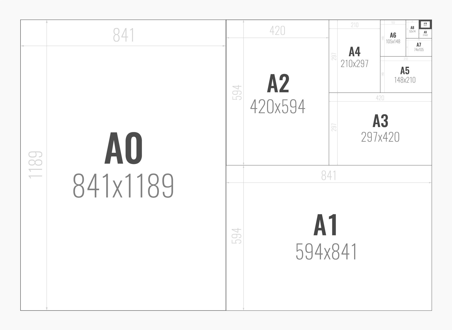
A4 and A5 are the most popular paper sizes for brochures.
A4 brochures are cost-effective when it comes to printing and are the favoured option when you include a lot of content.
A5 brochures are more compact and perfect for when you have less content. They still give freedom of space for creativity. A5 brochures are also the most cost-effective when it comes to postage.
A4 and A5 fit easily through letterboxes, can be carried around and slot effortlessly into literature racks.
However, one disadvantage of choosing either A4 or A5 is that so will most other businesses, making it harder for your brochure to stand out.
If you are new in your sector and need to make an impression, consider different ways to make a standard paper size work for you.
At creative Harmony, your business needs are at the heart of every step of our brochure design process. We ensure your brochure stands out from the crowd by using different folds and brochure shapes that reflect your business.
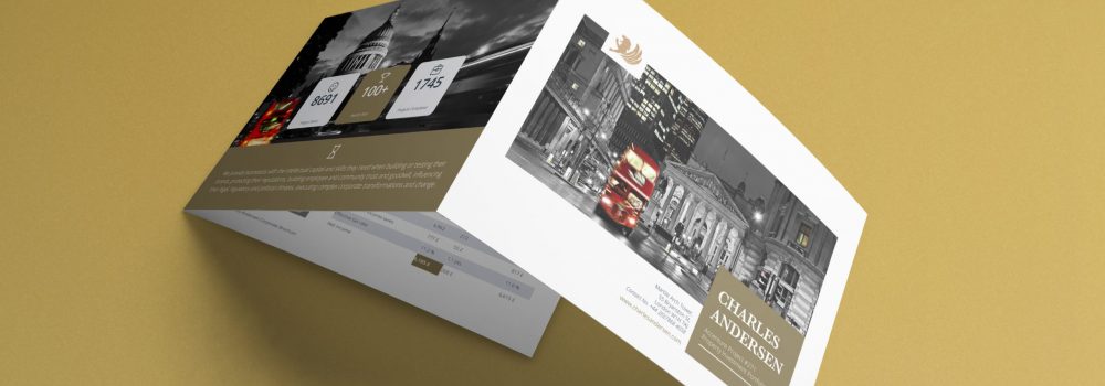
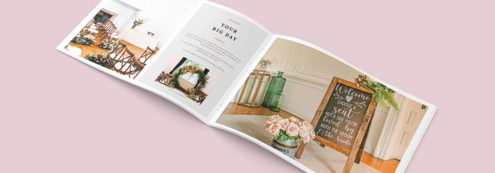
You can work with a basic portrait tri-fold brochure and make the colours pop or try a different fold or even a square brochure. These are still letterbox friendly and won’t break the bank in terms of design or printing.
We work within your budget, giving you the benefit of our expertise and experience, whether you want a standard brochure or a bespoke design that gives you maximum creativity.

Choosing your paper type
Paper is paper, right?
No, your paper choice affects your final product just as much as the size, fold and design of your brochure.
The two key considerations are paper density and the finish.
The thickness and firmness of the paper are referred to as its density. This is measured in grams per square metre or GSM. Corporate brochures are typically between 170 and 300 GSM.
Consider your brochure as you do a business handshake. You want it to be firm enough to convey professionalism and assurance but not so firm that it is overwhelming.
Finding the perfect print finish
The final piece of the puzzle is your print coating. It is just as vital to get this right as it is the size and shape of your brochure. A glossy or matt varnish provides your brochure with a more expensive look and feel. Lamination offers a smoother finish and extra protection.
Before you choose your print finish, you need to ask yourself again, what is the purpose of your brochure?
If you intend for your customers or clients to keep your brochure for months or years, a fully laminated brochure provides the necessary durability. Similarly, if your brochure is going into an industrial environment, lamination will support longevity against wear and tear.
If your brochure is for a one-off promotion, such a finish may be unnecessary, and you may want to spend your budget on other aspects of the brochure design. Other finishes that can be added to your brochure include embossing, foil stamping, letter press and UV varnish.
For more information and to see what we can do for you, call the team at Creative Harmony today. Work with an experienced London-based agency that understands how to meet your needs.
If you are looking at luxury brochure design, then you can see how paper and finishes will affect the quality with our engaging blog here: A Stunning Guide to Paper and Finishes to Ease the Cost of Brochure Design in 3 Simplified Steps.
Get in touch with us if you want to know more about designing a brochure. We create a stunning design that is just for you. Creative Harmony is built on expertise and our team can take your ideas to develop a stunning brochure design layout. Our team can bring your bespoke brochure design layout to life.
You can see relevant examples of our work Accountant Brochure Design and Property Development Brochure Design.
Company Brochure Design
Highly creative brochure design services will ensure your company, solution or product truly stands out. We specialise in tactile high-end printed brochures as well as dynamic interactive digital publications. Click here to find out more.
Want a brochure designed by professionals?
Need an award-winning brochure design agency to take care of everything from brochure concepting to printing? No time for those design-it-yourself brochure apps?
We’ll give you a brochure that looks good AND works hard to deliver what you need it to, whether that’s:
- More Sales
- Greater Awareness
- Communicating Your Values
Talk to our expert team of brochure designers today.

