How Do You Design a Brochure
In today’s business world, first impressions are everything.
That’s why your company’s brochure is so important. It’s often the first point of contact between you and potential customers, and it needs to make a good impression.
They’re everywhere, from showcasing new businesses and giving quick access to takeaway menus to driving traffic to new stores. However, this is only true if you get the brochure design right.
Perfecting brochures is all about design.
Excellent design compels audiences to read on and learn more about your business, what you offer, and so much more. Less than perfect design will leave your brochure lonely and ignored.
So perfect brochure design, how do you achieve it?
This ultimate guide to outstanding brochure design gives you all the information you could need to design, create and print the ideal brochure for your business.
Get it right, and you’ll see excellent results that make an enduring impact on your audience.
Let’s break it down into three manageable parts that cover everything, but feel free to skip around to the bits you want to know!
Contents
Part 1. How to Get Started with Brochure Design
Establish your success metrics
Part 2. 7 Steps to Design a Brochure – The Most Effective Brochure Design Process
Consider your brand design standards
Gather images, text, and other information
Experiment with brochure design
Bonus Tips: How to Make a Good Brochure
How to Choose Your Print Materials
How to Get Started with Brochure Design
Hear this.
Jumping into Canva, Photoshop, or using a brochure template to design a brochure off-the-cuff will never work.
Before diving into your brochure design journey, you must be clear on your business goals and objectives, as well as the do’s and don’ts of brochure design.
What do you want to achieve with this brochure? What is the purpose of it? Who is the target audience, and what should they feel when looking at it?
Knowing these things will help guide your decisions in the coming design stages.
Let’s break it down a little more and explore the five steps you need to take to ensure you’re set up and ready to produce a stunning brochure that helps you reach your business goals.
Know your brand’s personality
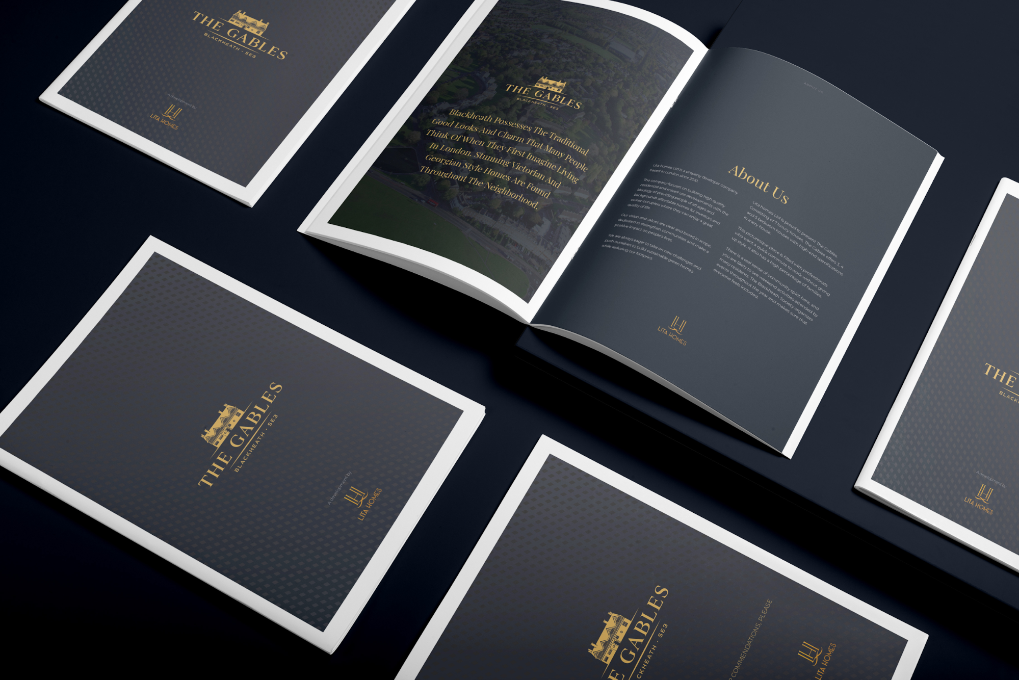
Your brochure is an extension of your business. Go back to basics and look at your brand’s identity (mission statement, vision and values, target audience) and ensure it’s reflected in your design.
Doing so leads to clarity and cohesive marketing and branding. There will be no overarching theme to your marketing materials, leading to lost and confused readers.
Imagine looking at a fun and cheerful brochure that looks so high-energy and charismatic, only to call the company to hear the drollest and most unexciting voice on the other end of the line.
It’s great to be unique, but consistency is crucial when you want your message to stick.
Define your perfect customer
It’s all well and good trying to create a brochure that will be attractive to everyone. The logic is simple – to entice as many customers as possible – but the reality is that this approach usually falls flat.
That’s because you’re not being specific about who you’re targeting. Focus instead on the people most likely to engage with your business, and create a design that appeals to them.
For example, most brochures for zoos and bowling alleys have multiple pages filled with fun cartoons and bright colours, appealing to families and children.
On the other hand, wedding venues will have pictures of beautiful brides, luxurious cursive texts, and fonts and colour schemes to appeal to couples looking forward to their big day.
Similarly, if you offer financial, mortgage, or real estate services, marketing materials with bright images and playful language would come across as unprofessional and childish. It would be difficult for your target audience to take you seriously.
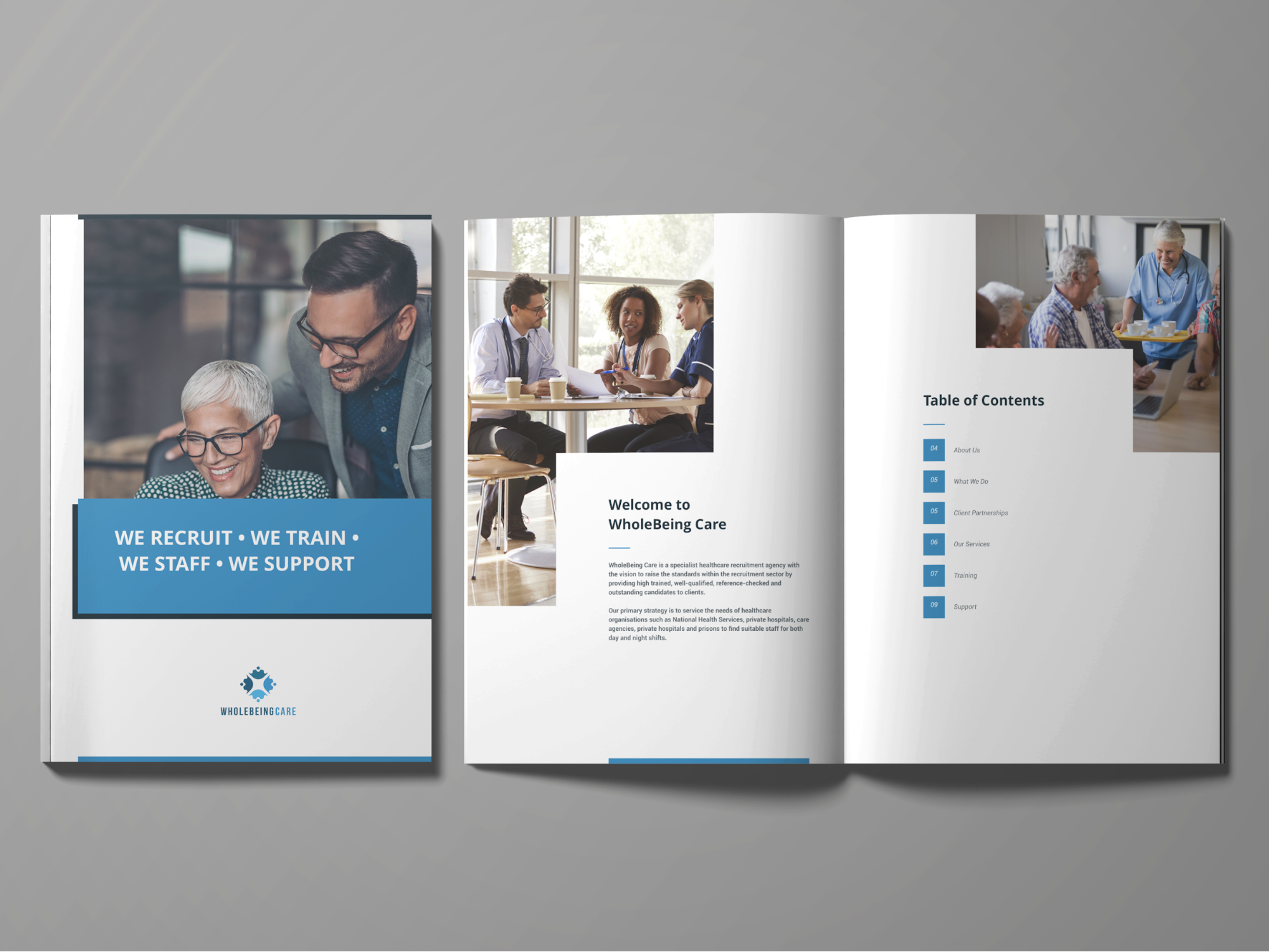
Those creating a well-designed brochure will always ask:
- Who is my perfect customer?
- What information or knowledge are they searching for?
- Are images or text more likely to garner a response?
- What are their expectations when it comes to copy? (i.e., conversational or corporate, serious or humorous)
- How can I best capture their attention?
Knowing the target market you’re designing for steers your designs and ensures that your completed brochure feels authentic to their needs and expectations. This improves your probability of success.
Develop your messaging
An effective brochure design only works when you have something clear to say.
Defining your messages is essential to ensuring they reach the right people in the right way. The aim is to capture readers’ attention and draw them in with a compelling story that reflects your brand’s personality and resonates with them.
For example, a luxury leather handbag company might focus on the craftsmanship and eco-friendly methods used to make its products. The brochure needs to convey this through text and image content.
The idea here is to give customers what they want. Highlight the value your business is providing through the content within a great brochure.
Are they buying your products because they’re high quality or eco-friendly? Are they coming to your venue because you offer catering or because the building is beautiful?
Defining your core message before starting the design process ensures that you make informed judgments that strengthen your message.
Establish your success metrics
Don’t worry; this isn’t as complicated as it may first seem.
Like you should be doing with any aspect of your business, an important step to success is looking at the content you’re producing and seeing how well it’s doing.
Is your brochure design achieving what you want it to achieve? Are you increasing sales, site visits, or bookings? Are you receiving more emails and query calls? Seeing a rise in these metrics proves whether or not your brochure is doing its job.
If it’s working, that’s great!
If not, then you might need to tweak and improve your design, so it works better. However, you can’t make actionable changes if you don’t know what metrics you’re monitoring, so it’s essential to have this in place from the start.
Most brochures will use success metrics like;
- Driving customers to a retail location. Including a voucher or coupon enables you to measure the number of people using your store by the number redeemed.
- Driving individuals to your website. Including a custom URL allows you to track visitor numbers during your campaign.
- Building interest in a product launch. Including a CTA encouraging people to sign up for a newsletter or mailing list allows you to compare new sign-ups during your campaign.
Set a realistic budget
Creating a budget is an important step in the brochure design process. After all, you don’t want to spend more than you need.
Set a realistic brochure budget and decide what elements to include in your brochure design. For example, you might want your brochure to have professional photography, custom graphics, and illustrations. You might need to buy a brochure template to get started.
You’ll also need to consider the cost of printing and distributing your brochures.
How sturdy do you need the brochures to be?
The sturdier you need them, the thicker the paper you need. Different printing techniques and inks will affect how your visuals look, and quality matters when you want to stand out. Think about budget-per-print and make decisions focusing on what’s most important.
Finally, you’ll need to look at any other elements you may need to include in your budget, such as investing in professional copywriting skills or design services.
Understanding your budget in detail for the entire designing, creating and printing process helps you make the most of every penny.
7 Steps to Design a Brochure – The Most Effective Brochure Design Process
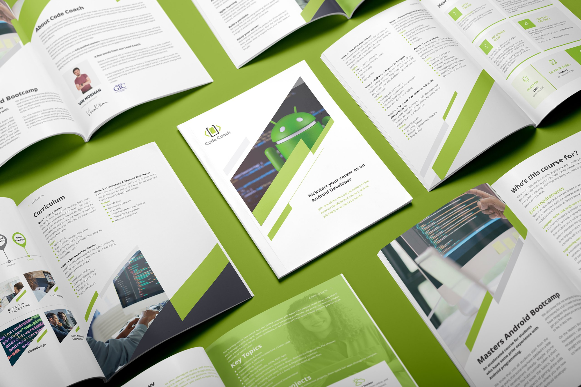
Now you’ve outlined your goals and expectations, it’s time to start putting pencil to paper. From your brochure layout and fonts to colours and images, there are many key elements to consider when designing your perfect brochure.
#1 – Consider your brand’s design standards
When designing a brochure, it’s important to always keep your brand design standards in mind. This means staying consistent with your brand’s look and feel and ensuring that your brochure design matches the rest of your communication material.
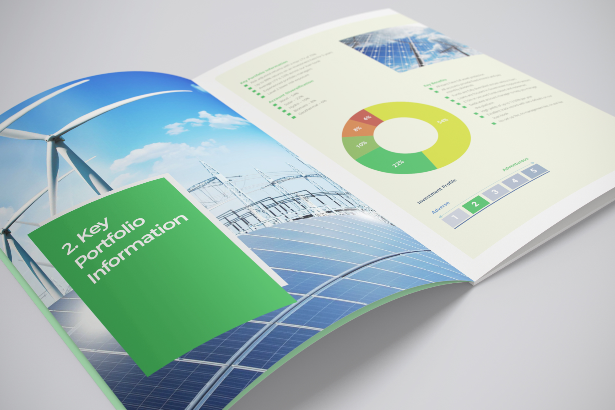
Remember, the visual elements of your brochure need to be consistent with other marketing components to create a single, easily identifiable picture of your company.
Select design elements (images, fonts, colour scheme) that fit your brochure’s content and your brand character. Ensure that fonts and colours used across your brand continue in your brochure.
If you’re using a professional designer, provide them with a style guide that outlines your brand’s design guidelines or even show them a brochure template you feel inspired by. This should include things like logos, fonts and colour palettes.
#2 – Design around your readers
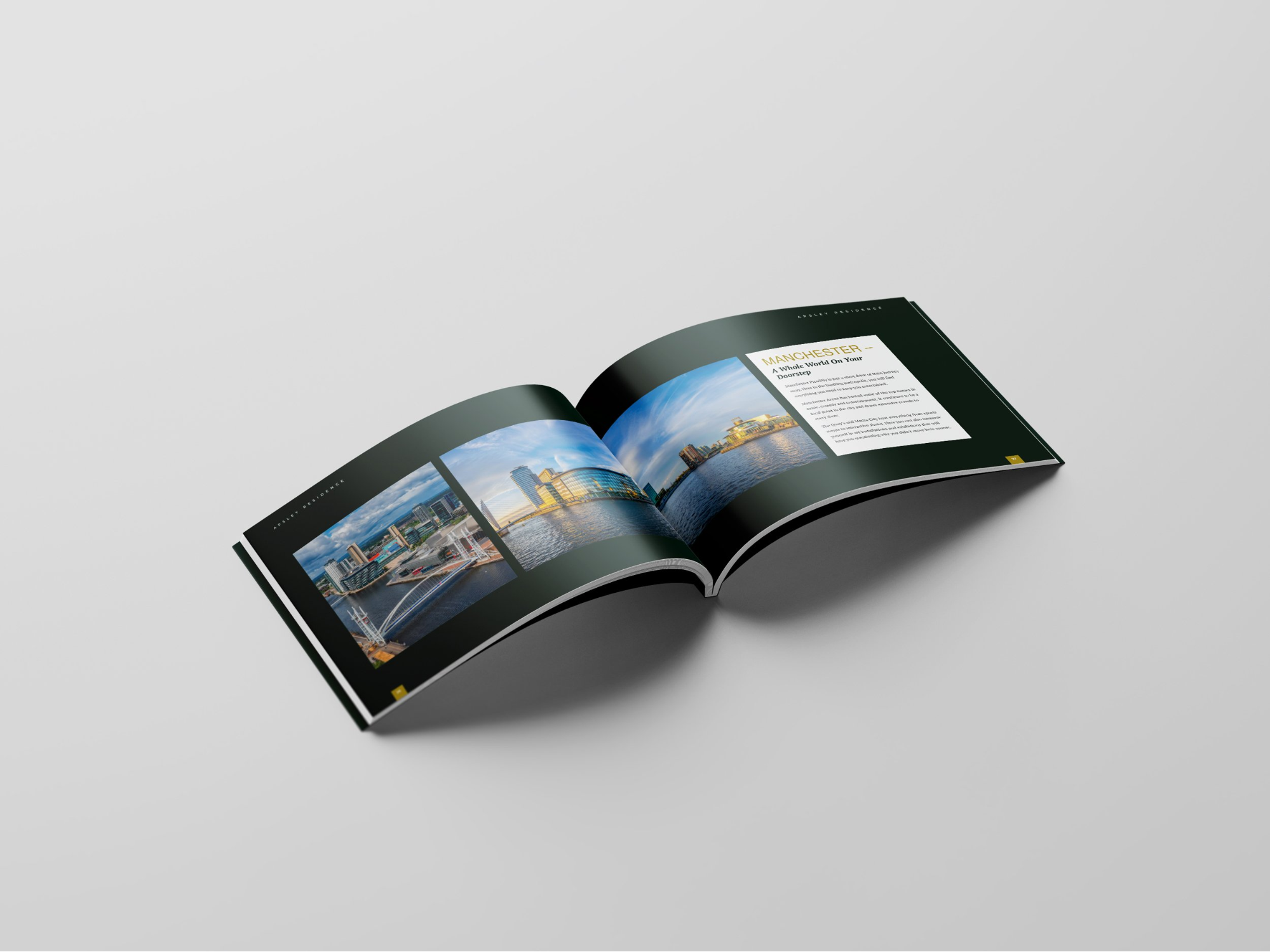
Your brochure is not for your business. It’s for your reader.
We know that sucks. You want to invest money in creating a beautiful, stunning, and professional-looking brochure, but what you want comes second to what your customers want. It’s their needs that need to be reflected in your brochure.
It’s a document that readers pick up in the hopes of getting value from you. Whether that’s information about your business, services, or products, or inspiration on how they spend their weekend, your readers want to learn something.
Therefore, design your brochure with them in mind and give them what they want in the easiest way possible.
This is the key to effective brochure design.
Think about the way your readers process information. For example, consider using illustrations instead of words if you want to explain a complex concept. If you’re going to tell a story, break it into easily digestible chunks with clear headings and subheadings.
Conveying a lot of information? Break it down into bullet points. Structure is crucial when it comes to designing a brochure for this very reason.
Remember, the goal is to make it easy for your reader to get the information they need.
#3 – Choose your brochure type
There are several different types of brochures that you can choose from, depending on your needs.
A few examples of how a great brochure can fold include:
- Accordion fold
- Double gatefold
- Half-fold
- Half + half fold
- Half + tri-fold
- Parallel fold
- Roll fold
- Single gatefold
- Tri-fold
- Z-fold
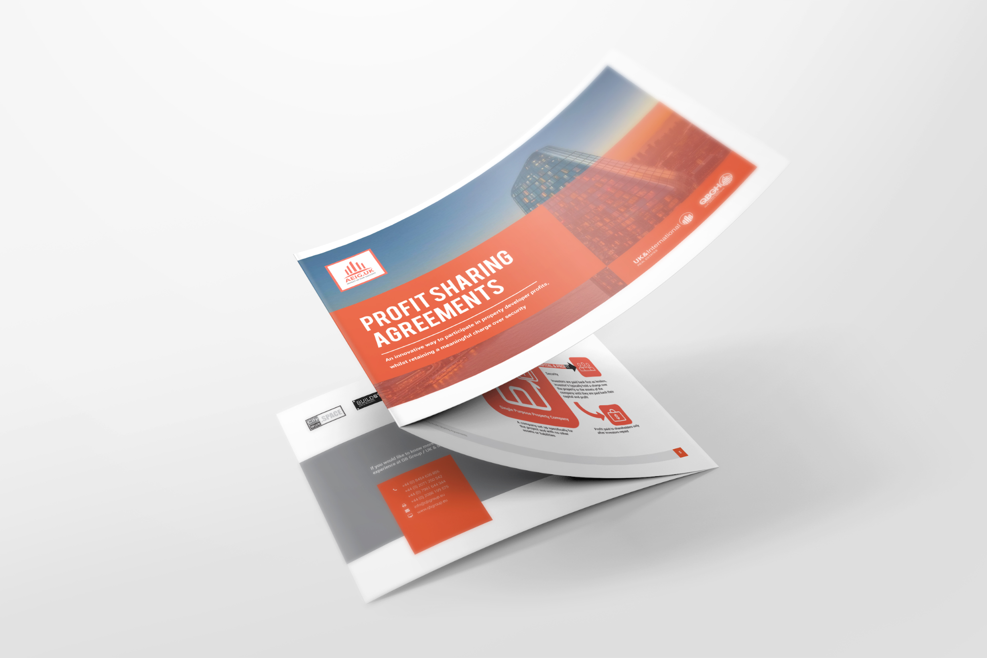
Each type of brochure serves a slightly different purpose, so make sure you choose the right one for your needs.
Consider that the classic Tri-Fold is great if you want to keep your brochure design simple.
If you have lots of information to communicate, you need an option with greater space, akin to a 16-panel fold or an eight-panel fold.
A four-panel roll fold or a standard brochure booklet may be most appropriate for creating a product tutorial or a step-by-step guide.
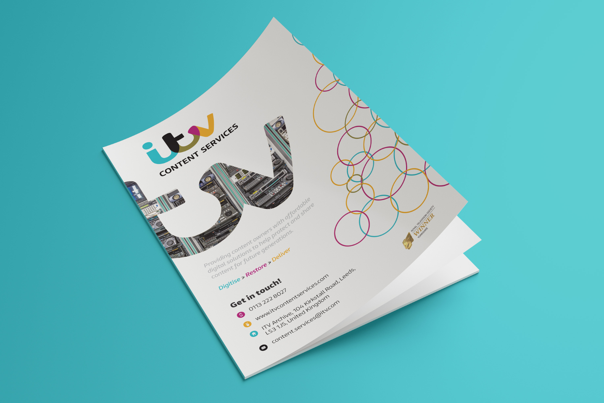
How your brochures will be delivered also plays a role in your decision.
Are the brochures being placed with other promotional gifts in a bag? Are they being displayed on a rack? Are they being mailed out? Your delivery or display plan will play a significant role in deciding the best fold for your brochure and business.
#4 – Gather images, text, and other information
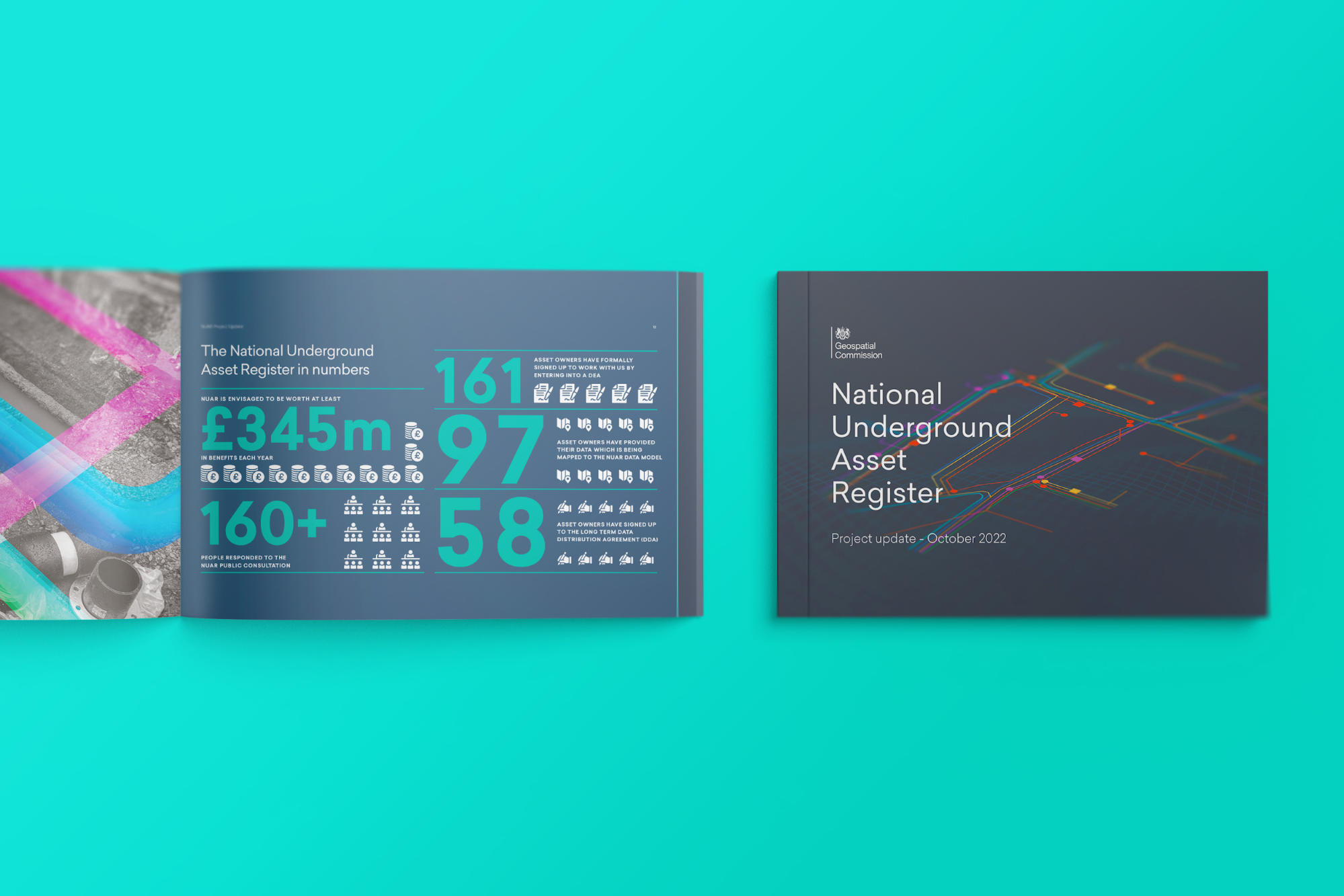
A brochure of statistics for the National Underground Asset, detailing statistics from the industry
To make a brochure successful, include relevant content and marketing material. Before you start designing, gather all the necessary images, text, and other information to complete the job properly.
There are few things worse than perfecting your design, only to find out you’ve missed a crucial piece of information and everything needs moving around again.
Other important tips include;
- Making sure your own visuals are of the highest quality.
- Illustrations must be consistent with your brand guidelines.
- Make sure your text is well-written and easy to understand.
#5 – Experiment with brochure design
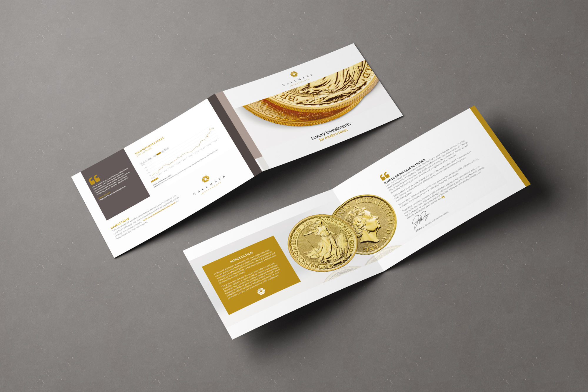
Two open brochures on a grey background displaying coins and related financial information
The chances are you’re not going to piece all the parts of your brochure together and get it right the first time. Text will need editing to fit the space. Images will need to move around, so they look right and don’t clash.
Don’t be afraid to experiment with different designs and ideas. If something doesn’t look right, don’t just give up. Try something else.
Be creative and bold.
It’s a brochure; after all, you want it to stand out from the crowd. However, remember that less can be more.
The KISS (Keep It Simple Silly) approach is an excellent principle to work with when making brochures.
3D Elements! A massive logo! Graphics! Glitter! Shiny Ink! Crazy fonts! Text, text and more text!
It’s too much, and if your readers feel overwhelmed, they’ll walk away. Too much of any element is just as bad as too many different aspects crowded into one space.
A clean, simple brochure design with an outstanding balance between flair and usability is the way to go. However, this doesn’t mean you can’t create a luxury experience.
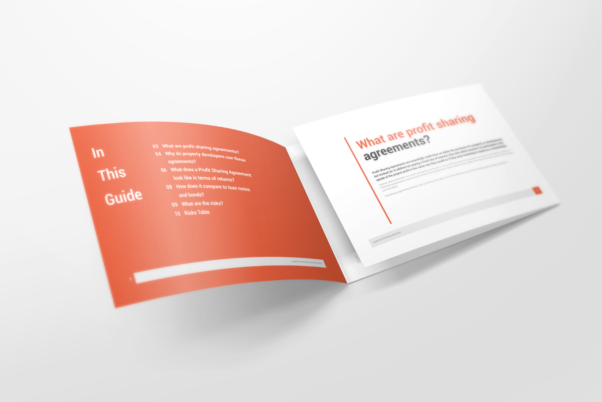
An open profit sharing agreement brochure highlighting a simple, orange contents page
#6 – Get feedback
Once you have a brochure design you’re happy with, get a second opinion to check it over and give feedback. This is important to make sure your design looks right and conveys the right message.
You don’t have to take on all the feedback you get, but it can be invaluable for getting a different perspective on your design.
#7 – Pick the perfect CTA
Your brochure should be designed with a purpose in mind. That could be to inform, educate, or inspire your readers. No matter your purpose, you should include a call to action (CTA).
Your CTA could be anything from signing up for a newsletter to downloading an app or visiting a landing page.
Make sure your CTA is clear, concise, and easy to understand. It should be the focus of your brochure and should not be lost amongst other information.
One of the biggest mistakes is burying your CTA in a mass of text on your brochure’s last page. If you do this, no one will see it. Your CTA needs to be impossible to miss. Make it bold, big and very obvious.
Your CTA must be centre stage and positioned in several places throughout your brochure. Doing this makes it incredibly hard to miss regardless of how far they read or skim through your brochure.
When you’ve gone through this process, you should be left with a brochure design that you’re happy with and ready to print.
How to Make a Good Brochure?
With all the tips and steps above, you should be in the mindset where you can make a professional, success-generating brochure.
However, if you’ve got your resources together and you’re playing around with various designs and you’re still not quite finding the final product you hoped for, here are a few tips to help you out.
#1 – Keep things simple
It’s easy to overcomplicate things in design, and to try and squeeze everything you want to say onto one page. It’s not always possible, nor does it need to be. Instead, keep things as simple as possible. This not only prevents overwhelming your readers, but it also highlights the core message you’re trying to send, without it becoming messy and unclear.
Think about when you read a brochure. Do you read every detail, or do you scan it to see what’s interesting? You and your readers are not so different in this regard.
#2 – Don’t be afraid of shapes
Simple shapes can be a great idea when it comes to highlighting information and adding depth to your brochure design. Shapes like squares, circles, hexagons, triangles and so on, can all be great ways to break up dull spaces and bring life to your design.
#3 – Subtly mix things up
A rounded corner VW brochure designed by Fernando Tucunduva. Source
If your design isn’t really hitting the spot you’d like it too, perhaps you’re focusing on the big picture too much and overlooking some of the finer details. Sometimes, small changes can make a world of difference, changes like;
- Slightly changing the colour, contrast, or gradient
- Rounding the corners of the pages to create a softer look
- Making fonts smaller or bigger
- Adding bold text and italics to key points
#4 – Make things fun!
You’d be amazed with how many brochures we see that don’t take one simple concept into account, and that’s being FUN.
Be FUN! Be ENGAGING! Be CREATIVE!
Get people excited about what you have to offer within your brochure and, indeed, your business.
When someone picks up your brochure, you want them to engage with your content and you want to encourage them to want to know more. You don’t want them to feel disinterested with your content and simply put it back down. What’s the purpose of a brochure that does that?
The truth is, so many businesses and designers aren’t brave enough to make their content fun. They’re afraid of highlighting text or adding shapes and dashes of color in the fear of scaring people away. But if you’re boring and too generic, you’ll do this anyway.
#5 – Do something different
There are plenty of brochures out there that all look the same. Just look at the leaflets of places to visit when you’re next at a bus or train station. Same styles, designs, colours, and images.
If you’re struggling to stand out from the crowd, then aim to differ from them.
Fortunately, there are plenty of ways to do this;
- Mixing up fonts and brochure styles
- Adding accent pages
- Adding aesthetic angles to pages and folds
- Using creative typography
- Use space, formatting, and design in a clever way
- Use die cut methods
- Use perspective in some form or another
- Work with different size designs
- Use texturing as graphics
- Consider using unique materials
Bringing all these points together, as well as going through the process of creating a great brochure as outline in the previous chapters, you’ll end up with a brillant brochure that’s ready for the selves!
The Final Steps
So, you’ve played around with various brochure designs, and you’ve got to the final stage. Now it’s time to finalise everything, so you’re left with a beautiful brochure that’s ready for the world!
Evaluate your design
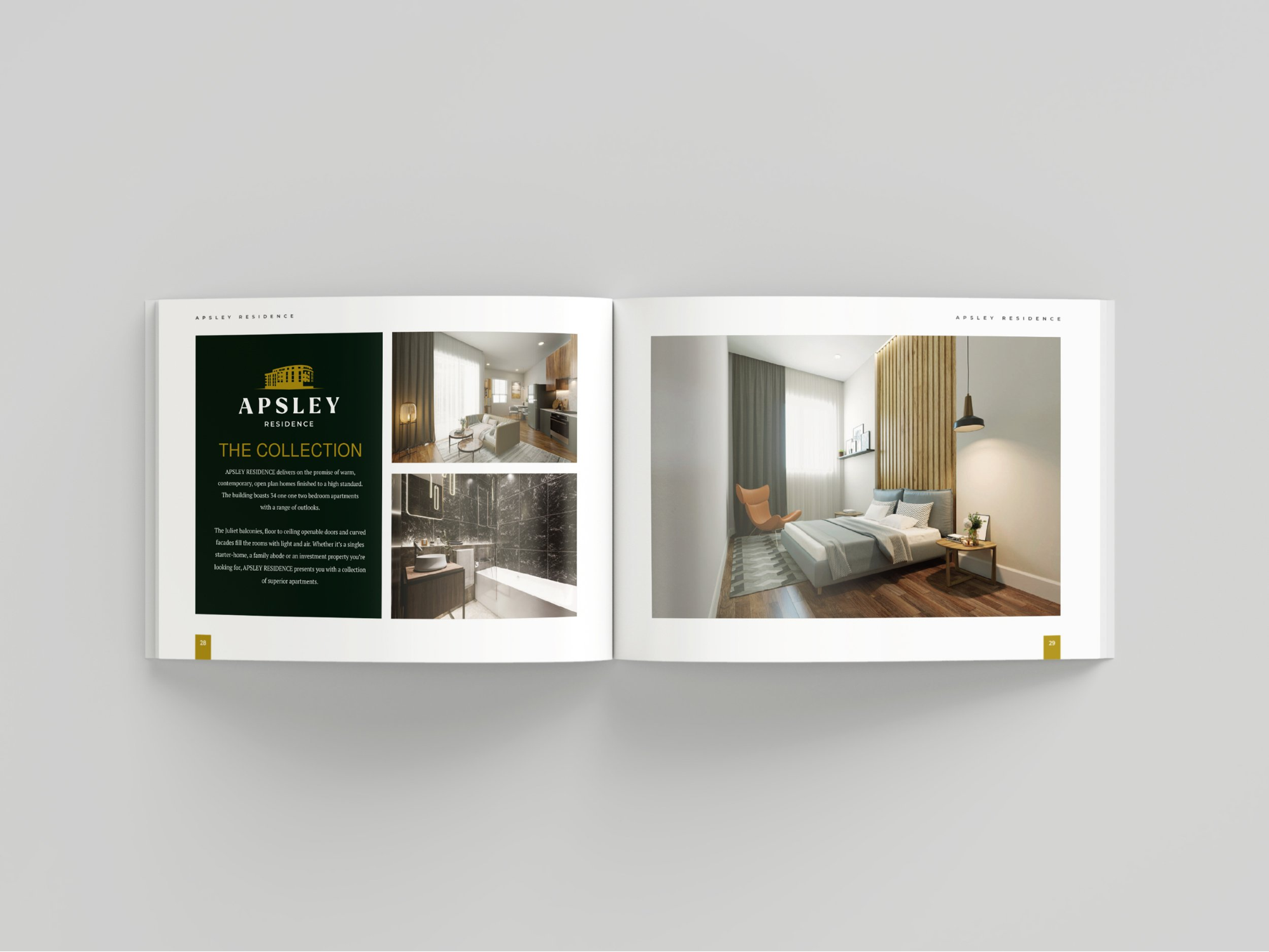
Bringing everything we’ve covered already, go through your brochure and ensure that everything you’ve created aligns with your original goals. Go through a few brochure designs to make sure it’s ideal for your target market.
Ensure the overall design is visually appealing and conveys a clear message.
Check for typos, grammar errors, and inconsistencies throughout your brochures. Double-check that all contact details, the URL of your website, and other information are correct. Otherwise, how will your readers connect with you?
Consider whether:
- The design of your brochures grabs the attention of your ideal customer
- The message is clear
- The call to action is front and centre
- Your brochures are on point with your branding
Again, don’t rely on just your opinion.
Talk to others to get their perspective. Colleagues, customers, friends and family are usually willing to give their thoughts and help you figure out whether it is perfect for your business.
Printing Your Brochure
Choose your printing service
An open brochure showcasing clean art, well-formatted text, and simple yet effective design principles
With your design ready to go, it’s time to find a printing service. Depending on your budget and the quantity you need, you can find the right service.
When choosing a printing service, be sure they’re reputable and have good reviews. Check out the quality of their paper and printing process to make sure your brochure looks its best.
Go prepared when you visit the printer and ask questions to determine whether they are the most suitable fit for your needs. Some example questions include:
- What is the best printing choice for cost? Time?
- Do you have experience in brochure printing and design?
- What ink options are available?
- Is colour matching something you provide?
- Do you provide printed or digital proofs?
- Do you have in-house designers?
- Do you have references from other clients?
- What happens if I’m not satisfied with my print job?
Your first option should be an experienced brochure printer with staff designers who use the most recent print technology.
Most printing services will print a sample for you to look through, allowing you to confirm that you’ll be happy with the final product.
How to Choose Your Print Materials
Getting your materials right is essential.
Your printer should work with you to select the best weight, paper finish and additional elements for your brochure design. Work with your chosen printer to choose the perfect materials for your brochure. Here are some tips to get you started.
Paper weight
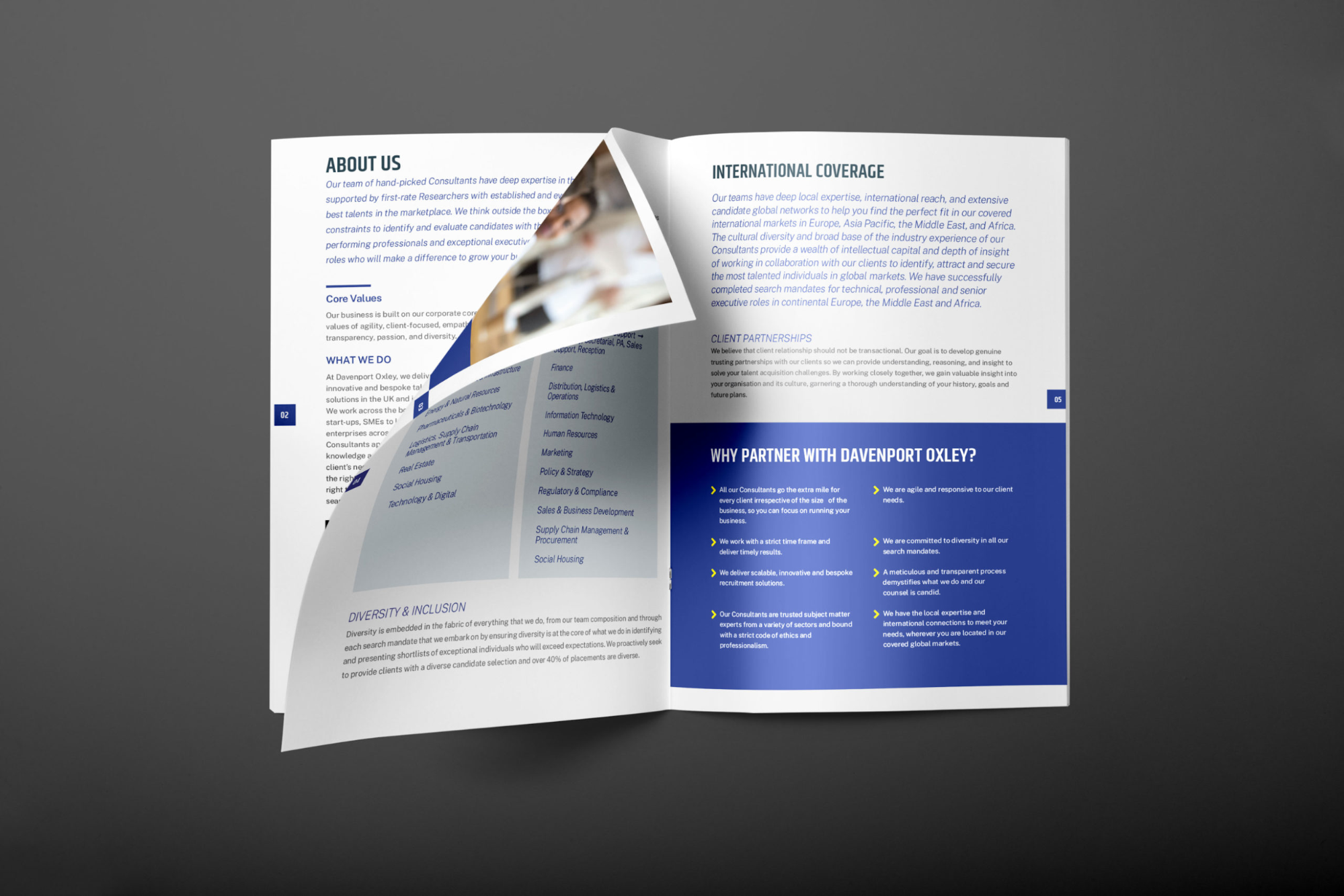
An open consultancy brochure turning a page, giving examples of formatted text and colour blocking
Paper weight can be measured in several ways (like mils and basis weight). However, the most used is GSM or metric weight. The GSM equates to the weight of a 1×1 metre square of a sheet of paper. As a rule, higher paper weight equals thicker sheets.
Generally, a standard brochure will sit between 170 and 300 GSM, but that’s just a rule of thumb. Choose what works best for you and your business’s goals.
If a weighty brochure will create a more professional and inviting feel and impression of your business and this is what you want, run with it.
<h4 “font-size:24px;”>Finish
The finish of your brochure depends on the quality of the brochure’s surface. There are several to select from:
Matte: No shine on the paper, an entirely flat finish
Semi-Gloss: sits in the middle of matte and glossy with some shine
Glossy: A reflective, shiny finish
Your printer should have the experience needed to guide your choice of finish. Discuss the brochure’s purpose and budget with your brochure maker to assist you best.
Speciality processes and ink
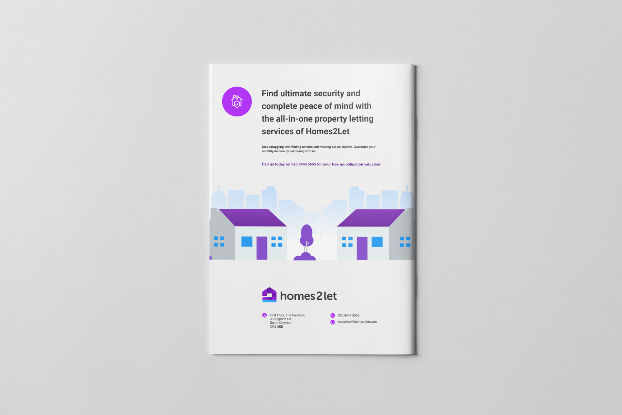
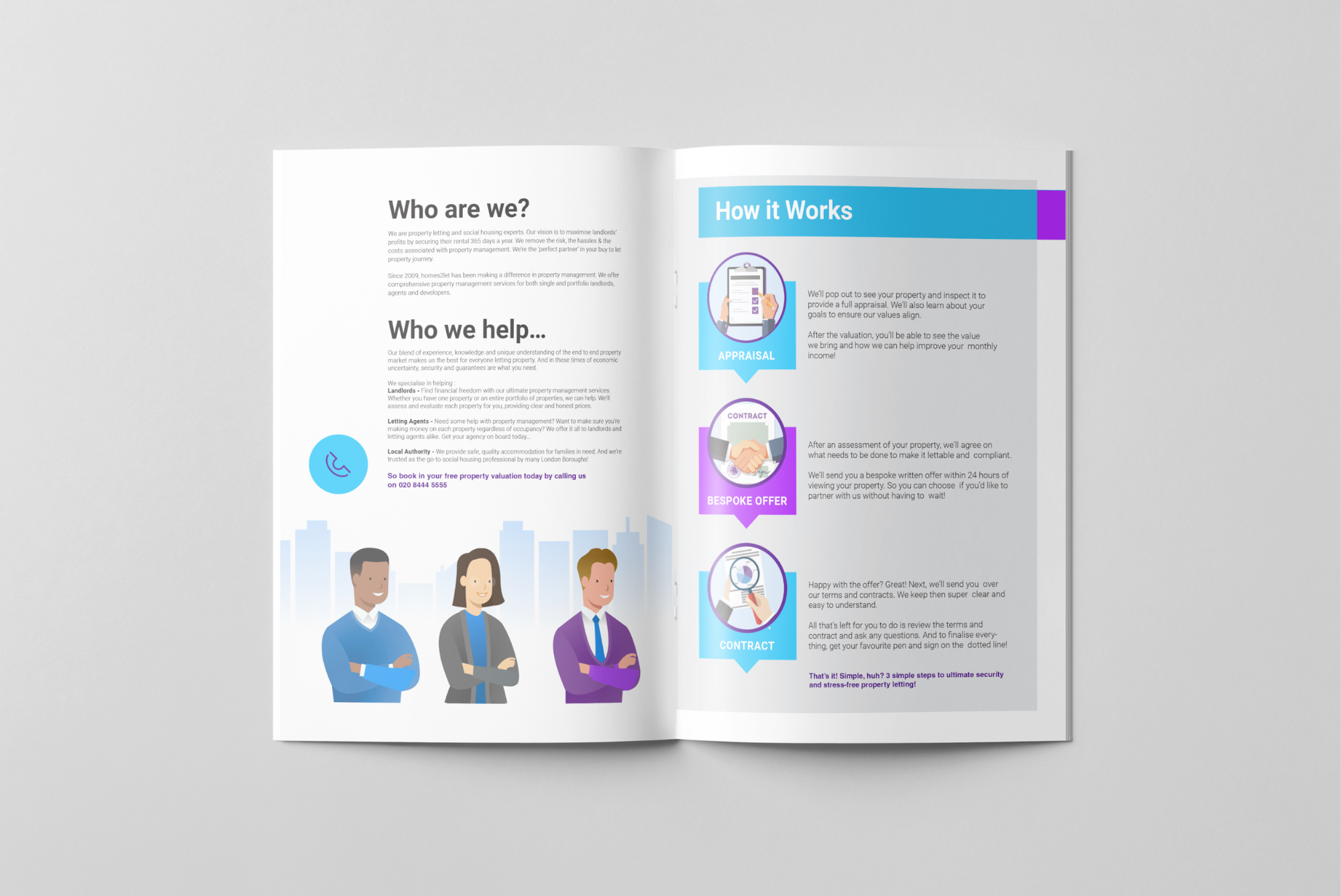
The rear cover of a real estate letting brochure showing vector graphics and bold headers
Speciality inks can enhance brochures and give them the extra wow factor. Options to enquire about include:
Foil: A metallic, shiny stamp or ink that reflects light
Embossing: An image or shape is pressed into the paper, creating raised effects
UV spot: Applying shiny coatings to specific areas (usually the accents, headline or logo)
Ask your printer or brochure maker about the available options and how they’ll affect your brochure, production time and budget.
Print and distribute!
With your brochure designed, printed and ready to go, it’s time to get it into the hands of your audience.
You can post them out (via mail), hand them out at events, or even distribute them digitally.
No matter how you distribute your brochure, make sure people know it exists and understand what they should do with it. Encourage people to share it with their friends and family.
You now have a brochure that you can be proud of, ready to promote your business.
Summary
And there we have it – everything you should need to create a perfect brochure design for your business.
A brochure design that delivers your on-brand message and inspires your readers to act, bringing you one step nearer your goals. That’s how to design a brochure that grabs your audience’s attention and entices your ideal client to want to know more.
However, we understand it’s a lot of work, and designing a great brochure as part of your marketing strategies isn’t easy.
Here at Creative Harmony, we know what makes a good brochure great. With years of graphic design experience, a portfolio filled with prestigious clients worldwide, access to the world’s leading design software, and dozens of five-star reviews, it’s safe to say we know how to make a brochure easy.
Contact us today for a free, no-obligation quote within 24 hours, and enjoy our high levels of personal service and commitment. We make life easy, so you can focus on doing what you do best.
We’re with you every step of the way.
Happy marketing! 🎆🚀😁
FAQs
Q: How do I know if my brochure is the right size?
A: Typically, a brochure should be between 8.5″ and 11″ in width and 11″ and 17″ in height. However, your preferred brochure size will depend on your desired outcome, so it’s best to discuss this with your printer before you start.
Q: What is the best format for a brochure?
A: Brochures are most commonly formatted as a tri-fold, or “z-fold”, which consists of three panels that you can fold in and out. However, brochures can also come in other formats, such as bi-fold (two panels) and gate-fold (four panels).
Q: What are the best practices for designing a brochure?
A: What you include in your brochure will depend on its purpose, but there are some rules of thumb every brochure should follow. Typically, you should include key information about your product or service, such as a brief overview, main features and relevant images. Additionally, you should include contact information (such as your website or phone number), so potential customers can get in touch.
Otherwise, what’s the point?
Moreover, you should always make sure you check your brochure of spelling and grammar errors, ensure the print is aligned properly and everything is spaced out accurately, and that all the content is delivered in a way that your reader will understand.
Always, always, always write and produce content (brochure content and otherwise) with your target audience in mind. This should always be at the heart of everything you do.
Q: What paper should I use for my brochure?
A: The type of paper you use in your brochures will depend on several factors, such as the budget, the type of design, and your desired finish. Generally speaking, you can choose between a matte or glossy finish and various paper weights. Speak to your printer for recommendations.
Q: How do I make sure my brochure stands out?
A: You can make your brochure stand out by using speciality finishes such as foil, embossing, or UV spot. You can also use vibrant imagery, illustrations, and graphics to bring your design to life. Colour will always be a great way to make a statement and add impact.
Q: What is the best program to create a brochure?
A: Adobe InDesign is the most popular software for brochure design. This brochure maker offers a range of features that make it perfect for designing professional-looking brochures. If you want something simpler and more affordable, then Canva or Vistaprint’s brochure template options may be better.
Q: Is a professional brochure designer worthwhile?
A: Yes! A professional brochure designer can create a unique, eye-catching design that accurately communicates your message. They can also help you with the printing process, ensuring that your brochure looks perfect when you receive it. They also have access to the best software and expertise in getting the best results from it!
Creative Brochure Design
Creative &, hard working design for brochures, reports, prospectuses & newsletters. Marketing literature that creates excitement with outstanding design and stunning visuals. Brochures are still one of the most important sales tools for promoting your company’s message and will help to set your customer on the right path to engaging your services or making a purchase. Click here to find out more.
